this post was submitted on 26 Sep 2024
494 points (94.4% liked)
Games
31898 readers
2702 users here now

Welcome to the largest gaming community on Lemmy! Discussion for all kinds of games. Video games, tabletop games, card games etc.
Weekly Threads:
Rules:
-
Submissions have to be related to games
-
No bigotry or harassment, be civil
-
No excessive self-promotion
-
Stay on-topic; no memes, funny videos, giveaways, reposts, or low-effort posts
-
Mark Spoilers and NSFW
-
No linking to piracy
More information about the community rules can be found here.
founded 1 year ago
MODERATORS
you are viewing a single comment's thread
view the rest of the comments
view the rest of the comments
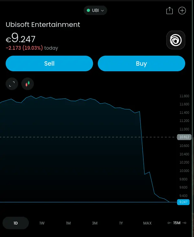
Jesus fuck no, it's a valid graph. It shows the relative trend over time and the sudden change. It may show less of a change if it was zero based, but a drastic change that is well off the normal trend is important to visualize. Also like, all exchanges have a toggle to flip to the zero based.
I'd argue it doesn't accurately show the relative value at a cursory glance. The chart shows the area under the curve having decreased over 90%, but when looking at the y-axis, you can see that initial assessment was misled.
In a speculative industry like finance, shouldn't we try our best to make charts less... alarmist?
Look at this thread and realize that it's just a lie. You can show the exact same information with a starting at zero graph, but won't be able to push the “stock is tanking!” panic point. Publishers and marketers do this on purpose to manipulate headlines. This is why the stock market is mostly just high stakes gambling. No one involved is making rational decisions, just moving from panic to mania like psychotic patients.
The stock is tanking. 20% is a huge drop for any massive company. Do you know how much money disappeared overnight because of this? From my very rough calculations, Ubisoft just lost about 300 million dollars because of this drop. That's more than any fine they've had.
The worst day in Stock Market history was Black Thursday, the beginning of the Great Recession. The market only dropped 11% that day. (Somebody call me out if I got those numbers slightly wrong, that's from Wikipedia). These are massive numbers, that I don't think you fully appreciate or understand. The stock market usually deals in single digit or more likely fractional amounts of change. Double digit changes are a huge deal.
So they have 300 million dollars less to spend? They’re going to fire 300 million dollars worth of talent? Their bank account changed by 300 million dollars?
No, they did not lose 300 million dollars.
I do know, none. Not a single cent disappeared. Because stocks aren't liquidity. That money was never there in the first place. Some paid some money to get those stocks, that money was real and it entered the company's liquidity. Then they spent it on something. Those stocks are but the promise of paying some dividends, some time in the future or giving some power inside the company. Their virtual fluctuations of price over time are nothing but smoke and mirrors, people exchanging virtual titles over those rights like little kids trading collectible cards. Some people cashed out for a low price (that was already grossly overinflated from the pandemic days, so they probably still made bank) and it pushed an already correcting stock to accelerate for today. That money didn't come from the company, it was exchanged entirely by third parties, public traders. Ubisoft didn't participate at all in whatever pushed the price drop. No matter how much I want it to, Ubisoft is not in any more danger today than it was in yesterday. They are still filthy rich, if anything the biggest danger for this is that it gives them lee way to layoff another group of underpaid developers or gut another studio to appease the stockholders. Who are already in a frenzy for blood because Outlaws didn't make all the money.
If you were to compare Ubisoft today to Ubisoft 2 years ago, you would see they dropped nearly 93%. Dear golly, how is this poor boutique family company in business after such a massive loss? /s
You can see right there at the top of the graph it's down 20% in the given timeframe. There are ways to make graphs misleading, but there's nothing misleading at all about zooming in on the data in this chart
Percentages are also misleading. The timeframe will always stretch the percentage. Sure, a 20% drop on the same day is significant, but it still says absolutely nothing about the overall situation, nor why it happened. It is a significantly smaller drop when compared to their year long performance, and a significantly larger loss if only the last month is taken into account. There's research on this, observing day to day changes on stock prices to describe a company is just as effective as describing people's personalities through astrology. It's bullshit.
Yes, and that's literally all this post is trying to convey. This post is not a news report or a economist's dissertation, this is a screenshot of the pre-bell stock price posted to a gaming community on Lemmy
It's already being called the lowest price in a decade. Technically true, but honestly disingenuous since the massive price bump to over €100 was an anomaly caused by the pandemic that swept the entire industry, not just this one publisher. Also drivel to generate engagement. Just like this post, here we are discussing it, despite the fact that it is misleading and poor characterization of the entire picture.
It sounds like you really need to buy some Ubisoft stock right now.
I will repeat, and I can't stress enough with this reiteration, fuck Ubisoft.
It being at its lowest price in a decade is literally true. I don't have a clue why you're bringing the pandemic into this since this stock reached its peak in 2018. Ubisoft stock has been on a precipitous decline for 4 straight years now, wtf are you even trying to convey here?
If you are not in for the dividents or the voting privileges stocks are always a game of "I hope someone is dumb enough to pay more than me for these shares".
Or someone else is in it for those things.
Markets aren’t based on one party being dumber than the other one. Markets work because different people value different things.