
Ai did a shit job.
-Ex graphic designer
"We did it, Patrick! We made a technological breakthrough!"
A place for all those who loathe AI to discuss things, post articles, and ridicule the AI hype. Proud supporter of working people. And proud booer of SXSW 2024.
Ai did a shit job.
-Ex graphic designer
Especially since the magicsh*t ai version will be SO identifiable as a favicon
I see an old-timey ghost inside a house silhouette.
Did you seriously think the freelancer isn't capable of creating something like that? Like, do you think that FedEx uses their name with a hidden arrow in the "Ex" because they couldn't hire anyone to draw them a photorealistic delivery truck with a box on it or whatever? Microsoft can't figure out how to make a window with reflections so they use the squares?
The simplicity isn't an accident.

Right?!? I wonder what happens when the business with the AI logo has to pay for full-color printing for all of their materials because their logo is so visually complex.
This isn't an issue if you solely operate digitally, but a storefront needs signage. Advertising becomes much more expensive in process color than 1 or 2 spot colors. Most physical businesses need things like business cards, invoices, purchase orders, packaging, ...
A professional designer will usually create a 1-color or 2-color logo to use for some of those things even when you have a full-color logo design to use on the most "important" materials. AI won't give that level of service, for sure.
You realise you are the ones in being ridiculed with rage bait ads here? Nobody uses these and it's, like with the last five thousand rage bait articles, only looking for engagement. Nothing else.
I think maybe this isn't the community for you.
Considering they probably fed the left image into the ai to make the right image, it’s rather silly.
“I made this logo with only an ai model, and can-do attitude, and a logo.”
I wonder if a fucker like this has commissioned a logo, fed an initial design through AI, and then refused to pay the initial designer.
"Guys I turned your Nike logo from a swoosh to wind blowing dust in a vague swoosh like shape also there's a foot there so you know where it came from and we'll stitch that on AAAAAAALLLL your products and guys... Guys? What do you mean I'm fired?"
This is the modern-day equivalent of Frontpage/clipart
I get what you're saying (esp low-quality clip-art), though lots of clipart was actually vector art (like autotraced from physical art, giving some prominent styles) so would probably make for a better logo than what they generated here.
Looks like they are missing the plot. Logos are supposed to be simple...
MagicShot.ai - Al Logo Geneator
Geat work
anyone with a year of design training will know why the right "logo" is a pile of shit.
anyone with a month of experience printing will know why the right "logo" is a pile of shit.
anyone who has had 5 minutes with genAI will think they're a design master when they create the "logo" on the right.
No. You don't need a year of design training. It is redicilous you buy in to that idea. It is a rage bait ad because it generates most clicks and therefore ad company revenue. Nobody alive thinks that is a good logo. That is the point.
I disagree.
Anyone who has spent a few minutes thinking about what a logo is and what it's used for will be able to tell you that one of these is a logo and the other is... a picture.
No experience in printing, but I guess its impossible to Print that Logo with that Kind of Detail in a timely manner without it looking like shit?
Also, everyone who ever heard about web design and hosting will know that such a picture is impossible to scale up and down, and also that picture will take up literal gigabytes since you can neither use normal PNGs because of the quality nor vector based art (they store the picture as mathematical equasions, so the PC has to render them, but it can be indefinitely made smaller and bigger without it becoming more pixely) because that sort of detail will just be impossible to render on grandmas smart TV from 2010, so you will have to store this picture as PNG in different formats as many times as you want to display that image
No, you understand the printing problem. Any logo needs a vector version so it can be scaled to any size. Lacking that is a non-starter.
And don't start me on the colors.
I legit thought Lemmy just got ads when I saw this post
Surprise, dear user! We're upgrading your experience to bring you only the best ads. Aren't you glad for us?
I've seen so many commercials where a realistic scene fades into the stylized logo that that's what my mind went to.
The left is a better logo, fewer fine details, easy to silk screen, easy to laser print, hell you could make a branding iron and burn it into wood.
The one on the right is prettier (not necessarily better. I've read some comments by people that know more than I do with some valid points). However, to create the image on the right, they probably fed the AI the image from the left, made by a designer.
Honestly, from a design perspective I do think the one on the right is actually better in some respects. Yes, it wouldn't scale well, there's too many colours, it's too busy, but it has some good points. The font choice draws you in more, with less space between the letters making it easier to read at a glance and the 'f' creating interest. And the house is actually united with the text, whereas in the left image it feels completely disconnected.
I would be pretty disappointed if I'd paid for a logo and I got the left image tbh, it's not very interesting or memorable. Yes, fuck AI, but I'm not sure this is the best comparison because both logos suck in different ways.
I wouldn't be surprised if she paid $5 on Fivr for the logo on the left just so she could say it's from a freelancer.
I don't like either, but the left one at least scales better for various applications across platforms and media.
Lol try printing that on merch, dumb dumb. That’s an awful logo. It’s really not even a logo, it’s a scene.
Reminds me of the very first Apple Computer logo:

They dropped that for a simpler logo, and then dropped the simpler logo for an even simpler one.
Morebranding than logo. Looks like a label from an old bottle of tonic.
Yet that is still simple for its monochrome ..... While the ai logo looks like tacky clip art.
Back in the day I legit wanted someone to make a custom black MacBook case that had the Newton logo instead of the Apple. Imagine how cool it would look glowing!
Imagine the printing costs of putting variations of the right on all your products? Just the color variety alone would add to the production costs.
And will look like shit even if you manage to do it. Imagine that on a cushion cover after an year of use.
Reminds me of German Designer Kurt Weidemann who redesigned the Logo of German train company Deutsche Bahn in the 90s. He inverted the colors, got rid of one outline — and still saves the company millions over the years because of the paint that is saved putting the logo on all trains. All while modernising the typography, but remaining true to the brand.
This is what design is about — everything else is decoration.
Someone doesn't know what a logo is for, I see.
I work in an industry that deals with customer logos almost exclusively. I now get at least one person a week bringing in garbage-tier art they made in Canva or whatever that isn’t made to any standard at all, so they have tons of thin lines, gradients, blurring, etc. Shocker, AI only thinks about making it visually appealing when it won’t translate to a one-color, doesn’t have PMS tones to base it on, no simplified version, etc.
People think making a logo is just that. Just the image itself. They don’t think past what’s in front of them.
That being said, there are also thousands of logos that go through proper design companjes and they pay a lot of money out and get literally just the name in a standard sans serif font or abstracted until it is unrecognizable as a name like KIA or TVA.
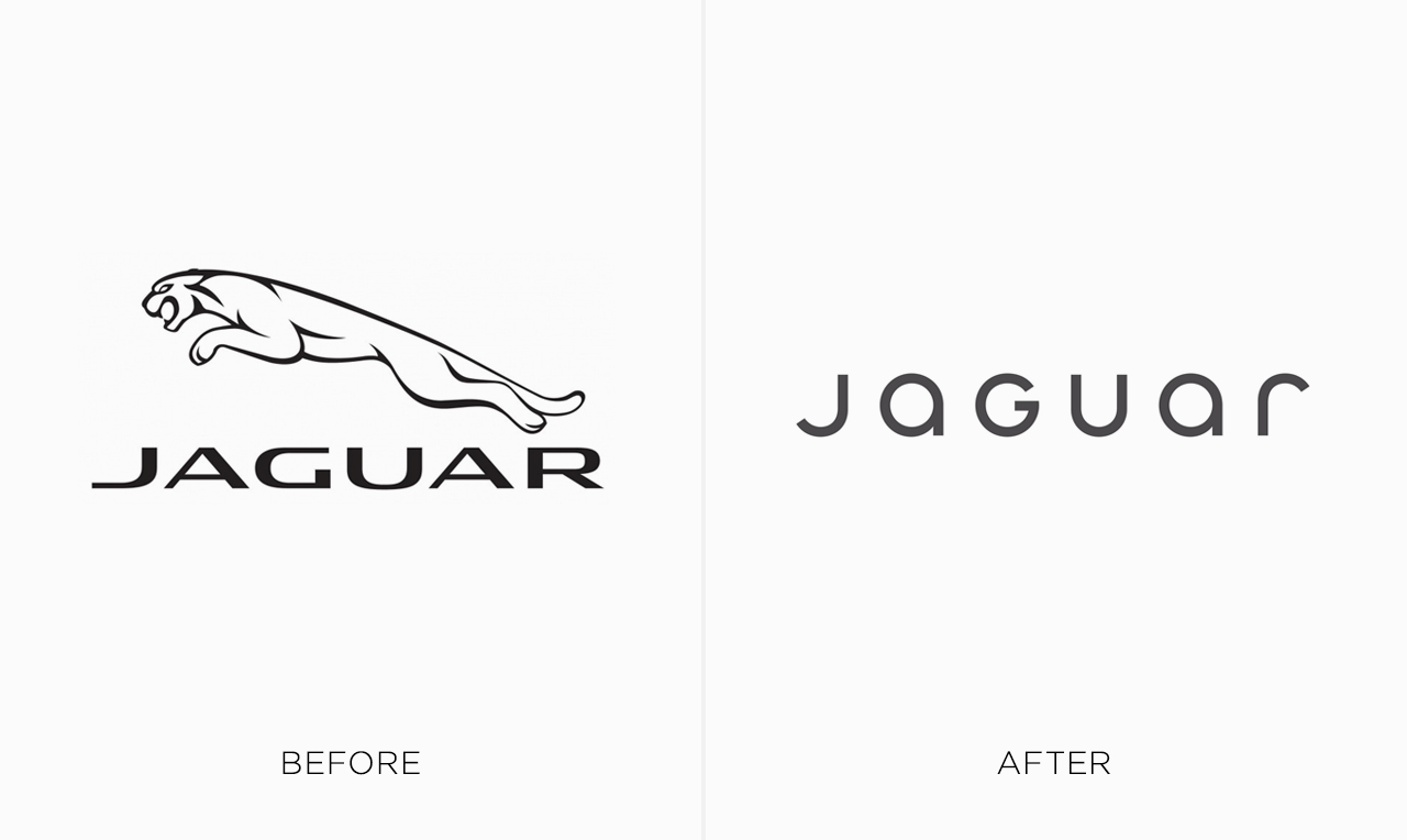
https://digitalsynopsis.com/wp-content/uploads/2024/02/logo-redesigns-rebrands-worst-jaguar.jpeg
https://nataleerushurst.blogspot.com/2022/08/alphabet-company-history.html?m=1
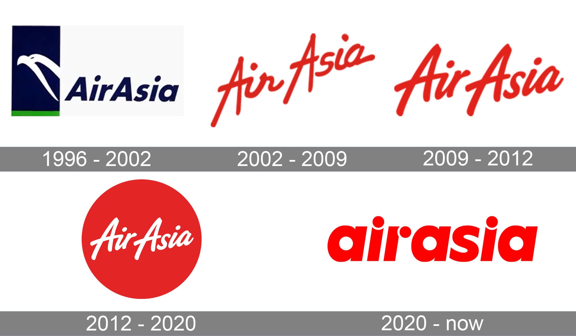
https://1000logos.net/wp-content/uploads/2020/04/AirAsia-Logo-history.jpg
https://storage.googleapis.com/ftidag_prod/activities/stad-gent-2/logoGent_c100.png
And the list goes on, Verizon, gap, tropicana, jcpenny, etc...
I mean, AI is trash, but it can also be extremely difficult to know if you will get a decent logo after paying thousands or tens/hundreds of euros spent (looking at you Belgium cities using millions of taxpayer euros for bad rebrands).
That logo is terrible.
Like, a core component of a good logo is that it’s easily identifiable at a glance at all shapes and sizes and on various backgrounds… complicated photorealistic logos basically lack all of these criteria by default.
This is why you need someone experienced not some ai slop.