this post was submitted on 06 Aug 2024
123 points (95.6% liked)
AssholeDesign
7544 readers
2 users here now
This is a community for designs specifically crafted to make the experience worse for the user. This can be due to greed, apathy, laziness or just downright scumbaggery.
founded 1 year ago
MODERATORS
you are viewing a single comment's thread
view the rest of the comments
view the rest of the comments


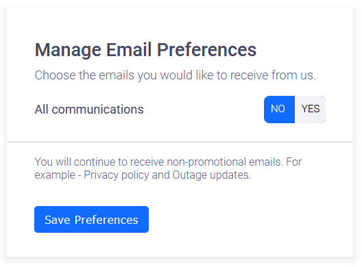
I would say it's fairly reasonable to assume that the selected option is the blue one? If not, that's definitely deceitful. If it is the blue one, I don't think it's purposefully deceitful, just badly designed. Don't attribute to malice what can be explained by incompetence, yadda yadda
Yep. I've had arguments on the bird site about intuitive UI/UX. It felt like I was talking to a wall. Some devs are just that clueless.
Only some? I’m constantly arguing with developers of enterprise software and they usually don’t get it. The color of a button to remove an item? Green! They like green …