Lemmy Be Wholesome
Welcome to Lemmy Be Wholesome. This is the polar opposite of LemmeShitpost. Here you can post wholesome memes, palate cleanser and good vibes.
The home to heal your soul. No bleak-posting!
Rules:
1. Be Respectful
Refrain from using harmful language pertaining to a protected characteristic: e.g. race, gender, sexuality, disability or religion.
Refrain from being argumentative when responding or commenting to posts/replies. Personal attacks are not welcome here.
...
2. No Illegal Content
Content that violates the law. Any post/comment found to be in breach of common law will be removed and given to the authorities if required.
That means: -No promoting violence/threats against any individuals
-No CSA content or Revenge Porn
-No sharing private/personal information (Doxxing)
...
3. No Spam
Posting the same post, no matter the intent is against the rules.
-If you have posted content, please refrain from re-posting said content within this community.
-Do not spam posts with intent to harass, annoy, bully, advertise, scam or harm this community.
-No posting Scams/Advertisements/Phishing Links/IP Grabbers
-No Bots, Bots will be banned from the community.
...
4. No Porn/Explicit
Content
-Do not post explicit content. Lemmy.World is not the instance for NSFW content.
-Do not post Gore or Shock Content.
...
5. No Enciting Harassment,
Brigading, Doxxing or Witch Hunts
-Do not Brigade other Communities
-No calls to action against other communities/users within Lemmy or outside of Lemmy.
-No Witch Hunts against users/communities.
-No content that harasses members within or outside of the community.
...
6. No NSFW Content
-Content shouldn't be NSFW
-Refrain from posting triggering content, if the content might be triggering try putting it behind NSFW tags.
7. Content should be Wholesome, we accept cute cats, kittens, puppies, dogs and anything, everything that restores your faith in humanity!
Content that isn't wholesome will be removed.
...
8. Reposting of Reddit content is permitted, try to credit the OC.
-Please consider crediting the OC when reposting content. A name of the user or a link to the original post is sufficient.
...
Also check out:
Partnered Communities:
6.Jokes
...
Reach out to LillianVS for inclusion on the sidebar.
All communities included on the sidebar are to be made in compliance with the instance rules.
view the rest of the comments

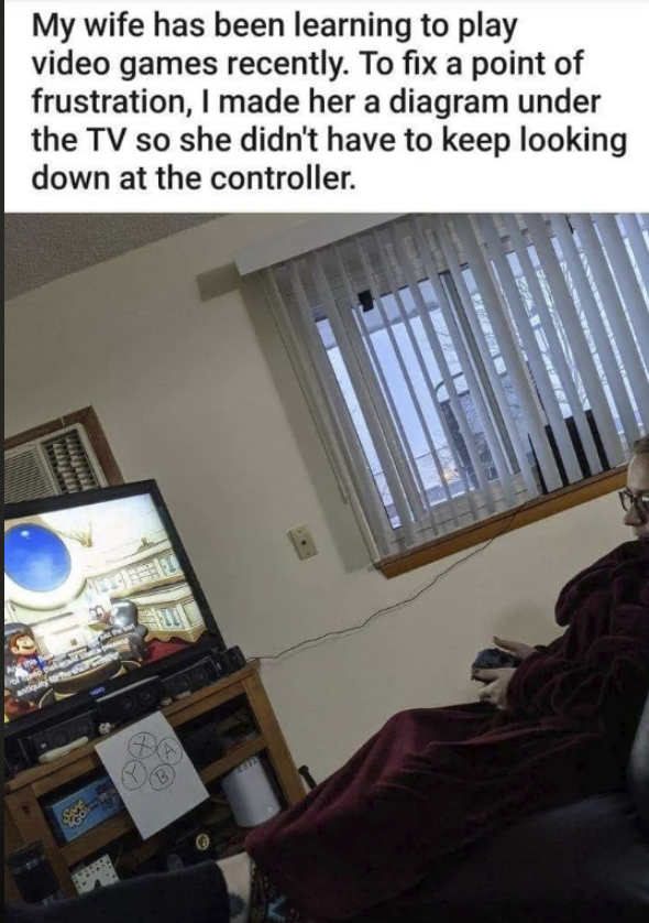
Sony also made their bottom button the default "confirm/execute" button and the side right button the "cancel/backout" button. It just feels more intuitive to me.
I've been gaming since the late 80s, so I understand Nintendo was the "first" of the current 3 hardware sellers. Doesn't change the fact that they're the outlier now. And it's not like their controllers have even had the same layout more than once, the SNES and Switch being the only two to share a relatively similar button layout.
And the Wii/U pro controllers. And Wii U tablet. And the DS and 3DS.
Here to note that this wasn't the way it was meant to be, on their controller, hence the common confusion you tend to get with a lot of games. I think it comes about as a result of them maybe trying to tread more of a line between the two, as, though we forget, there were more in the race than just nintendo, sega, and later, sony, back in the day, and nobody had really "settled" the layout. Sega, obviously, went for a layout that is basically opposite to nintendo. I don't know if it's purely a region locked thing, or if it's a game-by-game sort of thing (which seems like a stupid move but whatever), but the button layout in america, for playstation, has tended to conform more to nintendo's layout, than to sega's. I dunno why, maybe it has to do something with the popularity of certain consoles to certain regions, or something along those lines.
In any case, O is originally meant to be confirm, the X is meant to be cancel, which I think makes slightly more intuitive sense, pictorially. The O is the positive, the X is the negative. Obviously, over time, this sort of became swapped based on region, and actually, the PS5 is the one in which it's actually become universal that the O is the cancel button and X is the confirm button, for the japanese. Which is probably fucking infuriating, for them, I'd imagine.