this post was submitted on 04 May 2024
73 points (96.2% liked)

Boost For Lemmy

7048 readers
62 users here now

Community of the Android app Boost for Lemmy Play Store Link

founded 1 year ago
MODERATORS
 

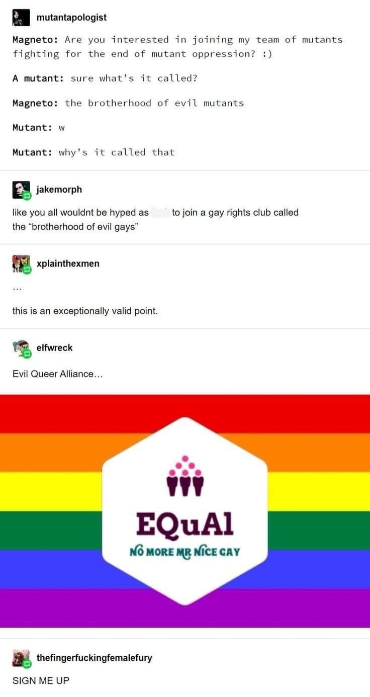
For me in the top of the image, there should be download button and stuff.

The top is white and the symbols are white. There's no gradient. I literally can't see it.

I know this is dumb but I think it's also an easy fix as the bottom already has a gradient.

Edit: credits to the OP of this https://lemmy.world/pictrs/image/b722cda5-9fd5-4dc0-8f57-450d8f5ee8d7.jpeg

you are viewing a single comment's thread
view the rest of the comments
[โ€“] brown567@sh.itjust.works 4 points 6 months ago

I agree! It would be nice if the download button had a contrasting outline