Cool Guides
Rules for Posting Guides on Our Community
1. Defining a Guide Guides are comprehensive reference materials, how-tos, or comparison tables. A guide must be well-organized both in content and layout. Information should be easily accessible without unnecessary navigation. Guides can include flowcharts, step-by-step instructions, or visual references that compare different elements side by side.
2. Infographic Guidelines Infographics are permitted if they are educational and informative. They should aim to convey complex information visually and clearly. However, infographics that primarily serve as visual essays without structured guidance will be subject to removal.
3. Grey Area Moderators may use discretion when deciding to remove posts. If in doubt, message us or use downvotes for content you find inappropriate.
4. Source Attribution If you know the original source of a guide, share it in the comments to credit the creators.
5. Diverse Content To keep our community engaging, avoid saturating the feed with similar topics. Excessive posts on a single topic may be moderated to maintain diversity.
6. Verify in Comments Always check the comments for additional insights or corrections. Moderators rely on community expertise for accuracy.
Community Guidelines
-
Direct Image Links Only Only direct links to .png, .jpg, and .jpeg image formats are permitted.
-
Educational Infographics Only Infographics must aim to educate and inform with structured content. Purely narrative or non-informative infographics may be removed.
-
Serious Guides Only Nonserious or comedy-based guides will be removed.
-
No Harmful Content Guides promoting dangerous or harmful activities/materials will be removed. This includes content intended to cause harm to others.
By following these rules, we can maintain a diverse and informative community. If you have any questions or concerns, feel free to reach out to the moderators. Thank you for contributing responsibly!
view the rest of the comments

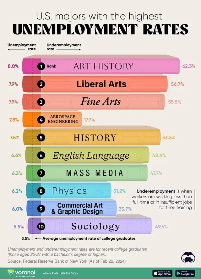
Edit: rereading the thread, I agree with your point that the graph is only showing which majors have high unemployment rates. Where that cause stems from (too many people with those majors for instance) isn't the intention of the graph. Not certain I agree fully with your statement
Is a liberal arts degree hard to get a job with because of too many people with the degree, or because there isn't sufficient transferrable skills included in the degree? All we know is that these jobs aren't best for securing a job after graduation.
I think we agree with each other. The only question the chart answers is whether or not these degree holders experience higher underemployment than the overall population. The question of why is irrelevant to this chart.
I was trying to disagree with the OPs skepticism that the chart is somehow misleading because it ignores the number of LA degree holder.