this post was submitted on 20 Dec 2023
604 points (100.0% liked)
196
16597 readers
2017 users here now
Be sure to follow the rule before you head out.
Rule: You must post before you leave.
founded 1 year ago
MODERATORS
you are viewing a single comment's thread
view the rest of the comments
view the rest of the comments

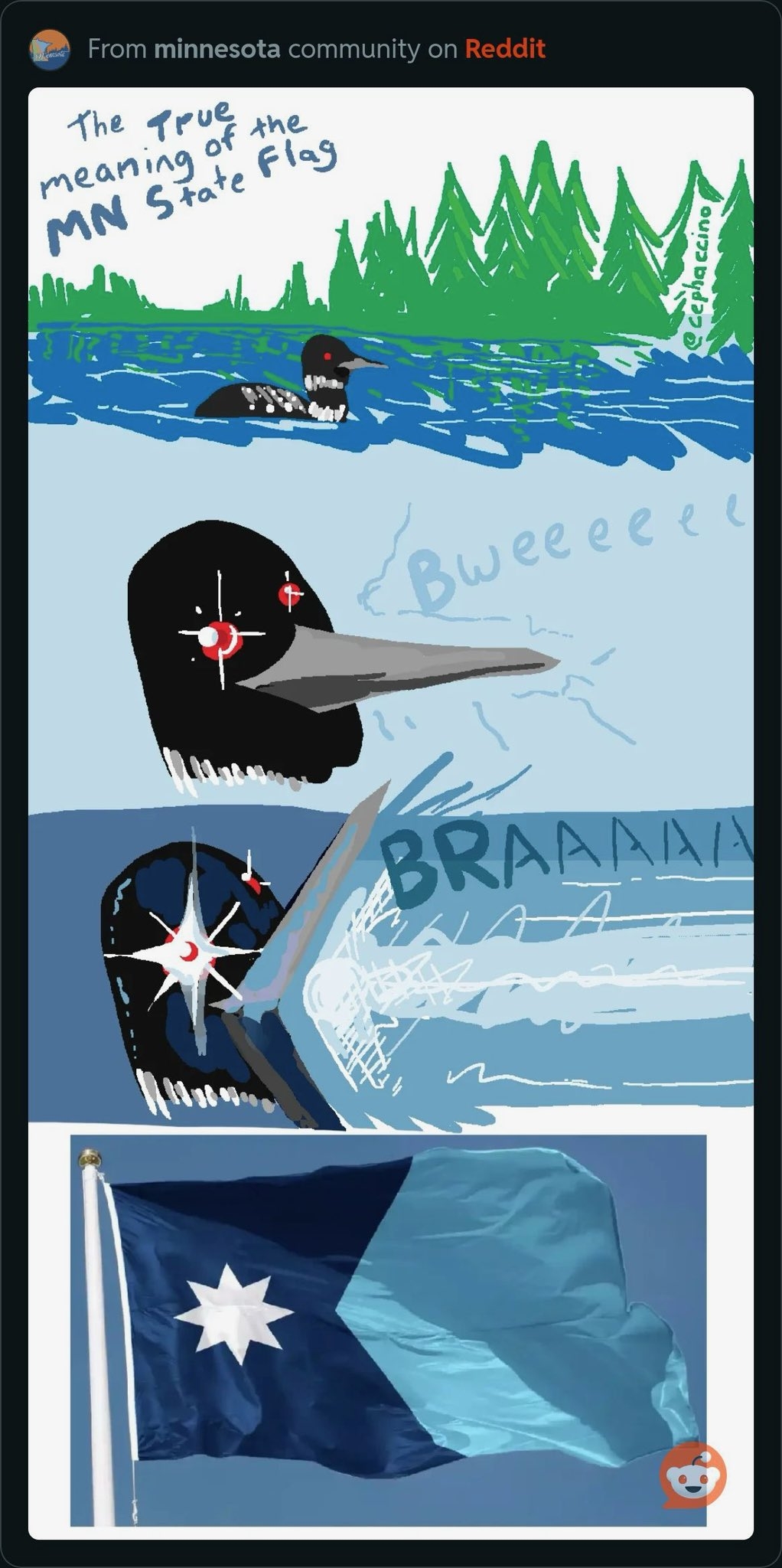
That's a good looking flag
My state is rocking the boring ass "seal on a bed sheet" look
If Oklahoma took the big "OKLAHOMA" off the bottom of the flag, we'd have a fairly kickass flag and there'd be something good to say about this shithole. It's not exactly Texas or New Mexico, but this state has a lot of history (especially with the tribes) crammed into a short segment of time so the symbolism is there. It's a complicated flag for a complicated place.
Prior to 1941, this is how the flag looked
And it's so significantly better. It's unique and truly representative of this place. Nobody is confusing this flag for another, except maybe for the blue field.
But hey, Tulsa's new flag is pretty great.
My state has the same.
At least my city flag rocks.
Chicago? Lol
Wichita.
That's a good one, Denver also has a great flag
That is a lovely flag.
Honestly I would have been okay with Minnesota's new seal on a bedsheet for the flag, we've got a nice looking loon now, but I like the new flag too.