Traditional Art
From dabblers to masters, obscure to popular and ancient to futuristic, this is an inclusive community dedicated to showcasing all types of art by all kinds of artists, as long as they're made in a traditional medium
'Traditional' here means 'Physical', as in artworks which are NON-DIGITAL in nature.
What's allowed: Acrylic, Pastel, Encaustic, Gouache, Oil and Watercolor Paintings; Ink Illustrations; Manga Panels; Pencil and Charcoal sketches; Collages; Etchings; Lithographs; Wood Prints; Pottery; Ceramics; Metal, Wire and paper sculptures; Tapestry; weaving; Qulting; Wood carvings, Armor Crafting and more.
What's not allowed: Digital art (anything made with Photoshop, Clip Studio Paint, Krita, Blender, GIMP or other art programs) or AI art (anything made with Stable Diffusion, Midjourney or other models)
make sure to check the rules stickied to the top of the community before posting.
view the rest of the comments


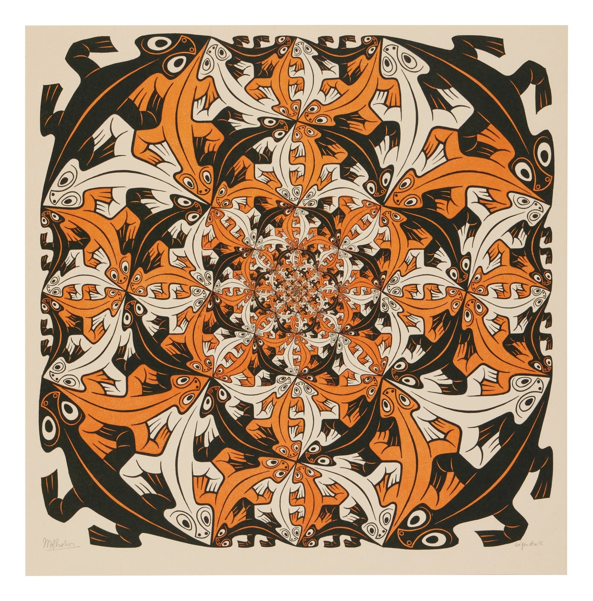
Alright this is the most neurotic thing I've ever written but the lizard primary->accent color map is
and at first I thought it would be more symmetrical if either the light lizards had medium accents or the medium lizards had light accents, but then I noticed that the outline is always dark, which lets the outline act as both the background and either the primary or accent color for every possible lizard configuration, adding depth. We don't have time to bring color theory into this but I would be remiss if I didn't mention that this piece is inexplicably sepia toned, which raises further questions such as "what is wrong with me" and "how am I going to put this piece in my dining room without having to defend the 1960's?"