this post was submitted on 21 Jun 2025
716 points (90.5% liked)
memes
15709 readers
2700 users here now
Community rules
1. Be civil
No trolling, bigotry or other insulting / annoying behaviour
2. No politics
This is non-politics community. For political memes please go to !politicalmemes@lemmy.world
3. No recent reposts
Check for reposts when posting a meme, you can only repost after 1 month
4. No bots
No bots without the express approval of the mods or the admins
5. No Spam/Ads
No advertisements or spam. This is an instance rule and the only way to live.
A collection of some classic Lemmy memes for your enjoyment
Sister communities
- !tenforward@lemmy.world : Star Trek memes, chat and shitposts
- !lemmyshitpost@lemmy.world : Lemmy Shitposts, anything and everything goes.
- !linuxmemes@lemmy.world : Linux themed memes
- !comicstrips@lemmy.world : for those who love comic stories.
founded 2 years ago
MODERATORS
you are viewing a single comment's thread
view the rest of the comments
view the rest of the comments
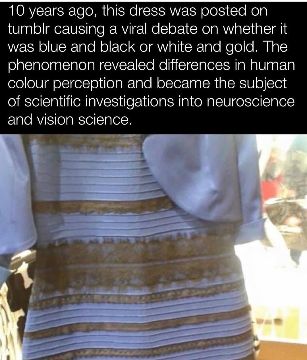
I never really understood the debate. In reality, if you were standing in front of the dress it is black and blue. Now, if you take a digital photo of the dress and post it on the internet as a terribly compressed jpg, with weird white balancing, and brightness/contrast turned up and down it is gold and white. The debate isn't really about the reality of the color of the dress but the reality of a badly edited photo.
It’s more about the colors around it. This image from Wikipedia does a really good job illustrating the effect.
Context is extremely important in identifying color. As Technology Connections tells us, for example, “brown is just orange with context.”
What always confused me is, the picture clearly seems to be overexposed, which means the blue/black interpretation should be obvious.
It's because we're also very used to seeing photographs of a subject in shade while the background is in full sunlight. If you take a picture of a white and gold dress in the shadow of a patio, with the background all fully lit by bright sunlight, the actual pixels representing white objects in the shade would be that bluish gray tint.
The problem here is that the dress isn't in the shade but those of us who see white and gold simply assume that it is in shade, while black/blue viewers (correctly) assume that it is under the same lighting conditions of the overexposed background.
This thread has been helpful for understanding how others could see it as white and gold; I never realized people were actually seeing it as in shadow even given the context of the rest of the picture.
I agree. But my wife was so firmly in the white/gold camp that I had to find this (and a better image of the actual dress, which is indeed blue and black) to help us understand one another’s perspective.
And what everyone seemed to omit: the reality of peoples' wildly uncalibrated monitors/phone screens.
Properly calibrated screen for graphic design here, multiple mobile devices. Never any major variance unless it’s a different image.
That sums up the entirety of the content on a number of popular subs on the R-word site.
Confusing perspective? No. More like confusing JPEG artifacts.
You used to be able to report shit for not being confusing, but it was placebo at best. That site sucks so much.
Is it, though? Is this dress in the pic only white and gold to everyone who looks at the picture/the original?