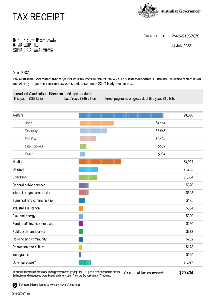
this post was submitted on 21 Jul 2023
127 points (97.0% liked)

Mildly Interesting

21633 readers
545 users here now

This is for strictly mildly interesting material. If it's too interesting, it doesn't belong. If it's not interesting, it doesn't belong.

This is obviously an objective criteria, so the mods are always right. Or maybe mildly right? Ahh.. what do we know?

Just post some stuff and don't spam.

founded 2 years ago
MODERATORS
 

I assume "Other purposes" is govt kickbacks to mining and gas companies 😬

top 50 comments
sorted by: hot top controversial new old
[–] gleph@lemmy.world 15 points 2 years ago (2 children)

I love that it helps you see how little of the welfare payments are going to the unemployed, since that’s the part that concerns people the most.

[–] Deez@lemm.ee 10 points 2 years ago (1 children)

That’s a newer addition, when it first came out under a conservative Goverment, all welfare was grouped together.

[–] Risk@lemmy.world 1 points 2 years ago

Classic Conservative tactic.

"Evil, stupid, greedy-" stuffs pockets "-jobless, welfare scroungers!" stuffs pockets "Pensioners, vote for me to bring down our welfare spending!"

[–] Z3k3@lemmy.world 4 points 2 years ago (1 children)

Uk government tried this a few yrs ago trying to spin the welfare part as work shy bambots then it came out that the lions share was pension pots that took up most of it with the teachers pensions being the one the media focused on

The US has a similar breakdown by % as this Australian one, except that what's called "welfare" in Australia is called "entitlements" in the US and makes up about 50% of the budget. Welfare in terms of the dole aka money given to "work shy bambots" makes up only about half of one percent.

[–] showmewhatyougot@lemmy.world 9 points 2 years ago (1 children)

Always liked this because it helps people see to some extent where money is going.

I know the UK and Portugal do this as well. It was especially interesting in the UK during the Brexit years because you could see a tiny piece of that pie chart with EU contributions, almost saying "this is how little of our money is going to Europe", didn't do any good in the end but hey, still great info to have that all detailed

[–] Risk@lemmy.world 1 points 2 years ago* (last edited 2 years ago)

the UK do this as well

They do?

Well shit, they do! Shame they don't actually tell you about it actively - as you said, they probably don't want most people to realise.

[–] MajesticNubbin@lemmy.world 8 points 2 years ago (3 children)

One thing to note about this breakdown is that it wasn't legislated with good intention but it was implemented in a very malicious compliance way that completely counteracted the original intention.

This receipt was legislated by the conservative party in Australia under Tony Abbott, the surface level intention was to "show where people's tax dollars are spent". However the underlying intention was to show welfare spending as a huge category that totally eclipsed all other spending in order to demonize welfare, particularly unemployment welfare. In order to build public support for rolling back that spending.

However when the letter was implemented, the welfare category was further broken down as you see here, completely working against the narrative that the government at the time was trying to spin (that unemployment welfare particularly was a huge drain on society).

[–] nxfsi@lemmy.world 3 points 2 years ago

Instead it shows that boomers are the real drain on society

load more comments (2 replies)
[–] dinckelman@lemmy.world 5 points 2 years ago (2 children)

I strongly believe that this should be the standard everywhere. Unfortunately most governments won't tell you this, because a few of them are busy building golden temples for their authoritarian leaders, and blowing half of it on cocaine while pretending it's the immigrants' faults

[–] Hazdaz@lemmy.world 2 points 2 years ago (3 children)

I agree with you 100% that this should be standard everywhere, but here's the thing... this information is readily available already.

At least in the US. But just like with most thing, it takes citizens a willingness to show the tiniest bit of effort to find that information.

https://www.cbo.gov/publication/58888

This is but one of many sites which show a breakdown of where our money in the US goes. Having one that breaks down each person's personal contribution would be especially interesting, but a percent is a percent so if 20% of our money collectively goes to X, then 20% of what your paid as an individual will also go to X.

load more comments (3 replies)
[–] lemming007@lemm.ee 0 points 2 years ago* (last edited 2 years ago) (1 children)

Not only this, I think this should be selectable by taxpayers before they pay taxes so they can customize the amount that goes to each category. This would be the true democratic way of doing it. So, for example, based on your salary you need to pay 20k in taxes. You'd then select how much you want to go into Transportation, Healthcare, defense, education, etc.

This would quickly force the government agencies to work for their money.

[–] selawdivad@lemm.ee 1 points 2 years ago

Tax-deductible donations get you part way there.

[–] Etterra@lemmy.world 4 points 2 years ago (10 children)

It must be so nice to see such a small bar for your defense spending.

[–] Kecessa@sh.itjust.works 3 points 2 years ago

It's still 8.6%, that's quite a lot actually...

load more comments (8 replies)
[–] DharmaCurious@lemmy.world 3 points 2 years ago (1 children)

Fun fact: in the United States you can request this same sort of receipt. It's slightly different, but all you have to do is request it, and they can show you exactly how many brown people they shot, or godless communists they've brought democracy to with your taxes!

[–] Mouselemming@sh.itjust.works 1 points 2 years ago

In the US they'd have to print it Landscape in order to have room for the Military bar.

[–] fidelacchius@lemmy.world 3 points 2 years ago (4 children)

Eww you guys are getting close to spending more on education than the military. Slippery slope.

[–] kboy101222@lemm.ee 2 points 2 years ago

It gets worse-

They spell defense with a c!

load more comments (3 replies)
[–] Poot@sh.itjust.works 2 points 2 years ago

In the US that would be a list of Congressmen and the Billionaires who own them.

[–] Emu@lemmy.ml 2 points 2 years ago (1 children)

Another thing that's great about aussie tax.. you can fill it out yourself, it's very easy, all online, and it takes a very short time. They also explain every question in the form and have lots of materials that you can read. For me, I finish it each year in about 10 minutes, and never think about it again.

[–] englishlad@lemmy.world 0 points 2 years ago (1 children)

In the UK tax is deducted 'at source' by your employer for anybody employed. You have a personal tax code, which tells your employer how much tax to deduct and pay on you behalf.

You then have a number of allowances you can claim against if you are eligible, to reduce your tax, which issues you an updated tax code.

[–] PersonalDevKit@aussie.zone 1 points 2 years ago

It is a very similar system in Australia. Must employees have their tax taken out when they are paid.

You can then claim deductions on certain things, and also make sure if you have multiple jobs you paid the correct tax.

Most people get some money back every year

[–] twistedtxb@lemmy.ca 2 points 2 years ago

That's slightly more than mildly interesting

[–] Pasketti@lemmy.dbzer0.com 2 points 2 years ago

I think something like this would make U.S. citizens feel better about taxes in general, since it can sometimes feel like you're throwing a large portion of your hard-earned money away.

[–] dragovaar@discuss.tchncs.de 2 points 2 years ago

Cries in American πŸ˜₯

[–] Centaur@lemmy.world 2 points 2 years ago

In my country government spending is mystery for tax payers.

[–] Gyella@lemmy.world 1 points 2 years ago (1 children)

It must be nice to live in a country where accountability is at least attempted. This shit would never work in Murica bc welll…. corruption.

load more comments (1 replies)
[–] MooseBoys@lemmy.world 1 points 2 years ago (1 children)

USA:

Defense: |||||||| |||||||| |||||||| |||||||| |||||||| |||||||| ||||||||
Boomer Welfare: |||||||| |||||||| |||||||| |||||||| ||||||||
Interest on Debt: |||||||| ||||||||
Everything Else: |
[–] Jonna@lemmy.world 1 points 2 years ago

As yet, social security is still a SELF-FUNDING program that lends money to the general fund. I'm gen-x, not a boomer. Stop buying into generational warfare. We have more in common with working class boomers than with gen Z tech bros.

[–] xradeon@lemmy.one 1 points 2 years ago

The US doesn't give you a nice little letter, but you can go to https://usafacts.org/visualizations/the-big-picture/ to see something similar.

[–] atyaz@reddthat.com 1 points 2 years ago (1 children)

In America, our government organizations can't pass an audit

[–] SeaJ@lemm.ee 1 points 2 years ago

Most can. The DoD has consistently failed for years. Yet we still keep ballooning their budget.

[–] PhlubbaDubba@lemm.ee 1 points 2 years ago

Problem is in the US since so much of that is put into private sector hands we'd need to gather data on those costs outside of the taxes to put together a proper picture.

[–] Saneless@lemmy.world 0 points 2 years ago (4 children)

This would be neat to see for the US

Health wouldn't be on there at all because fuck em

Defense would be spelled correctly and be so large that it would need to be on its own section, because the chart scale would distort things so badly that everything else would look like a sliver above zero

Education would be smaller than your immigration

Welfare, depending on the administration, would likely be some derogatory categorization for each group just to piss off their base

"other" would be the best biggest thing after Defense and provide no details, because it would be corporate subsidies and that would look bad

load more comments (4 replies)
load more comments
view more: next β€Ί