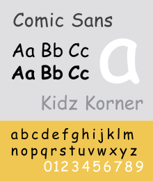
I think Comic Sans has been demonized by virtue of its misuse. It's a fun, no-frills font that has been slapped on in just about every document on the face of the Earth. It's easy to see how people could decide to use it even in serious situations, so nowadays I just chuckle if I see it misused. Also, it's great for dyslexic people so that's a point in its favor.
Typography & fonts
A community to discuss and share information about typography and fonts
Sibling community:
Rules of conduct:
The usual ones on Lemmy and Mastodon. In short: be kind or at least respectful, no offensive language, no harassment, no spam.
(Icon: detail from the title of Bringhurst's Elements of Typographic Style. Banner: details from pages 6 and 12, ibid.)
I’m going to use it in the future.
On April 1st of 2024 our company is going to receive a notification that our knowledge base is going to switch to all Comic Sans.
I’m brimming with antici- pation.
A friend of mine told me he attended a quite serious seminar about neuroscience once, with slides all in Comic Sans. And yet, to his (and my) surprise, the speaker really managed to pull it off!
Comic sans is so ubiquitous because it is easier to read for people with reading difficulties like dyslexia. So I let people do what works for them.
https://www.boia.org/blog/does-comic-sans-benefit-people-with-dyslexia
Atkinson Hyperlegible and OpenDyslexic are both fonts that were actually designed for that. And Atkinson at least doesn't look ridiculous.
I quite like it for readability when you want something less formal, but it’s so looked down upon that I don’t dare use it anymore.
It's like using ain't as short for am not. It's correct, but the word is so reviled that it can't be used unless you're going for a particular affectation.
Comic Sans is for silly stuff. Nothing wrong with using it for silly things.
