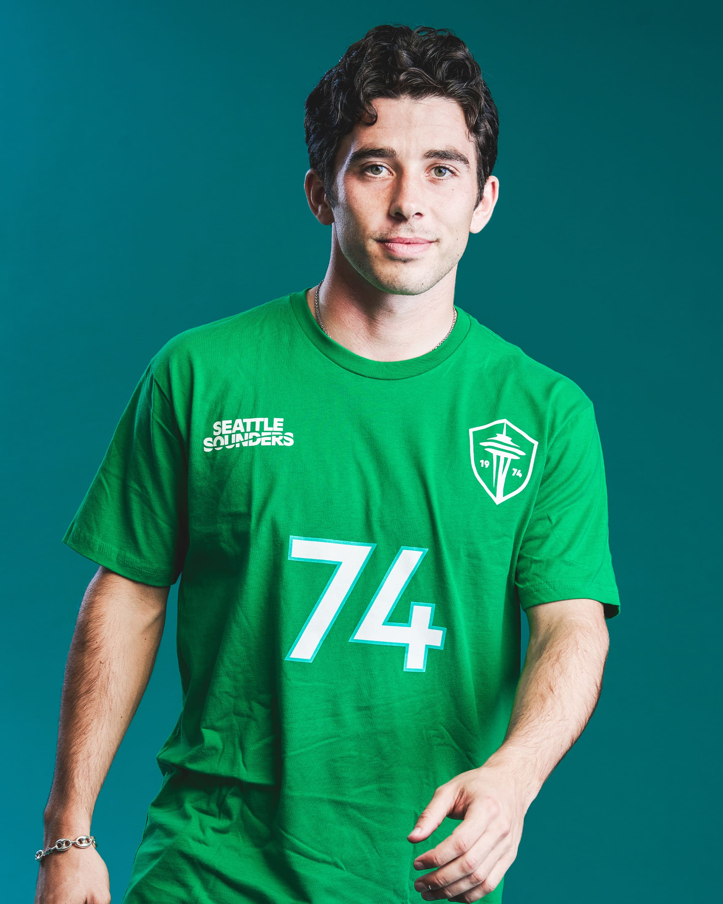
Also love that they had players and families model the new gear: https://www.soundersfc.com/eternally-yours/retail-gallery.
It does make me wonder if they signed Paul Rothrock primarily to be a model 😂

A place for Sounders fans in the Fediverse. Discussion, analysis, match threads, and more.
Looking for mods, banner images, and new ideas!
These are some proposed guidelines to get us started, but open to discussion!
Banner image credit: SoundersBruce on Wikimedia Commons (License: CC BY-SA 4.0)
Also love that they had players and families model the new gear: https://www.soundersfc.com/eternally-yours/retail-gallery.
It does make me wonder if they signed Paul Rothrock primarily to be a model 😂

Totally agree. The crest is miles better - looks much more modern. I really like the way that they managed to refresh without losing continuity. The Carnation and Orca are also great - can see picking up Carnation gear for myself and Orca stuff for the kid. The refreshed typography and wavemark in the text also feels fresh but a good throwback. All in all, a win, IMO.
I think the design is clean and fresh. Lots of sand in panties about it on tether social media....good drama. I love the way the team incorporates the community (not just hand it off to Nike for a redesign, for example)
I love it, can't wait to get a new jersey