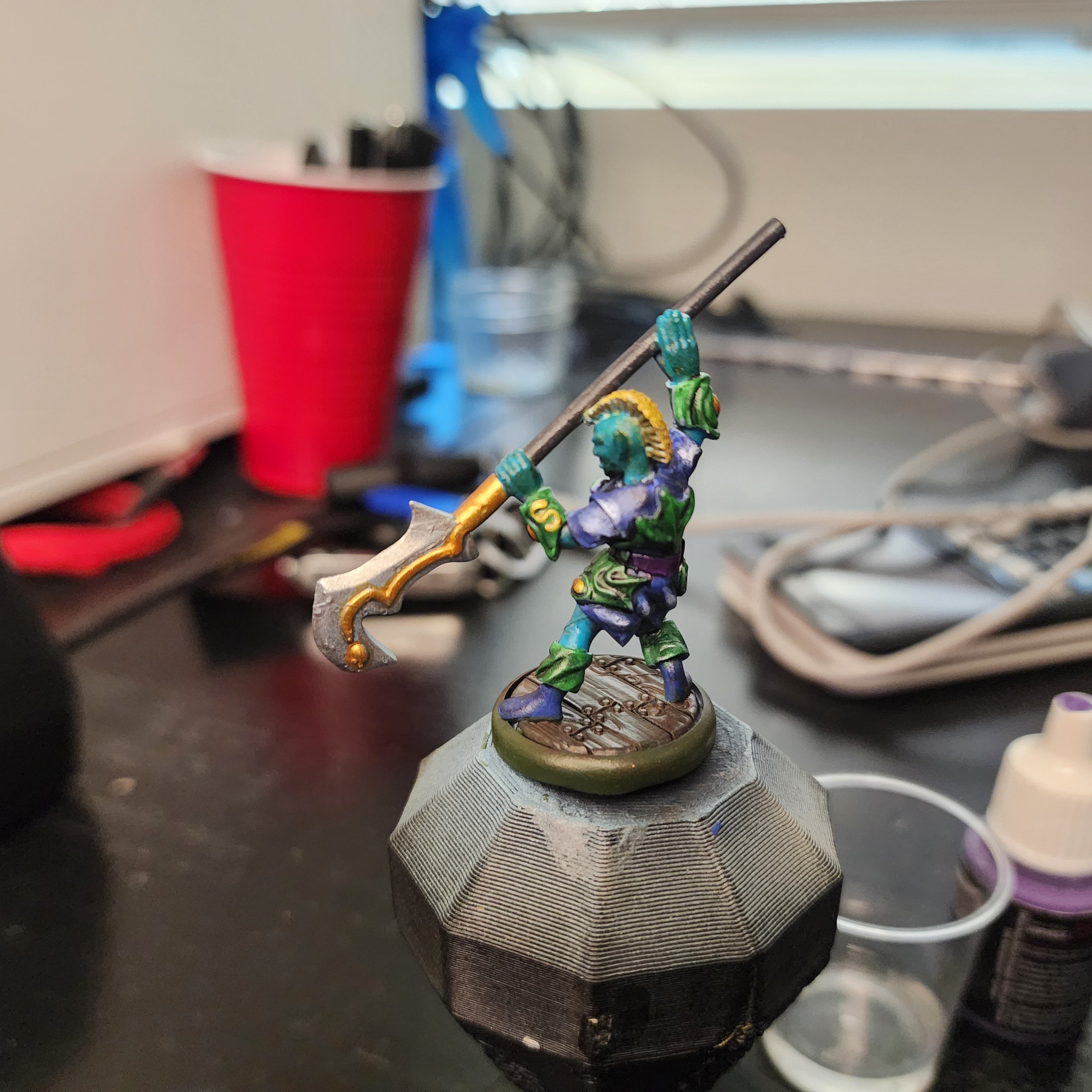
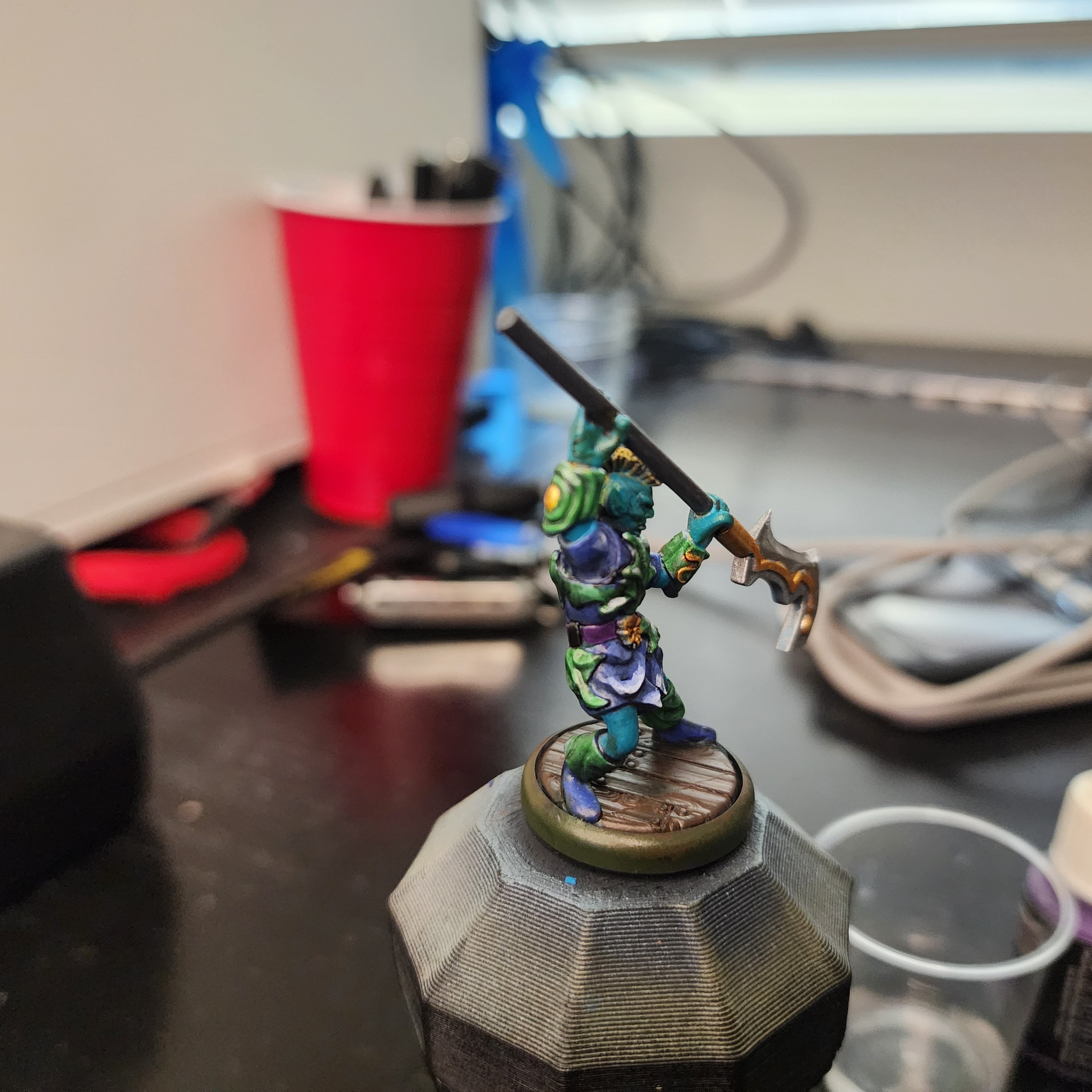
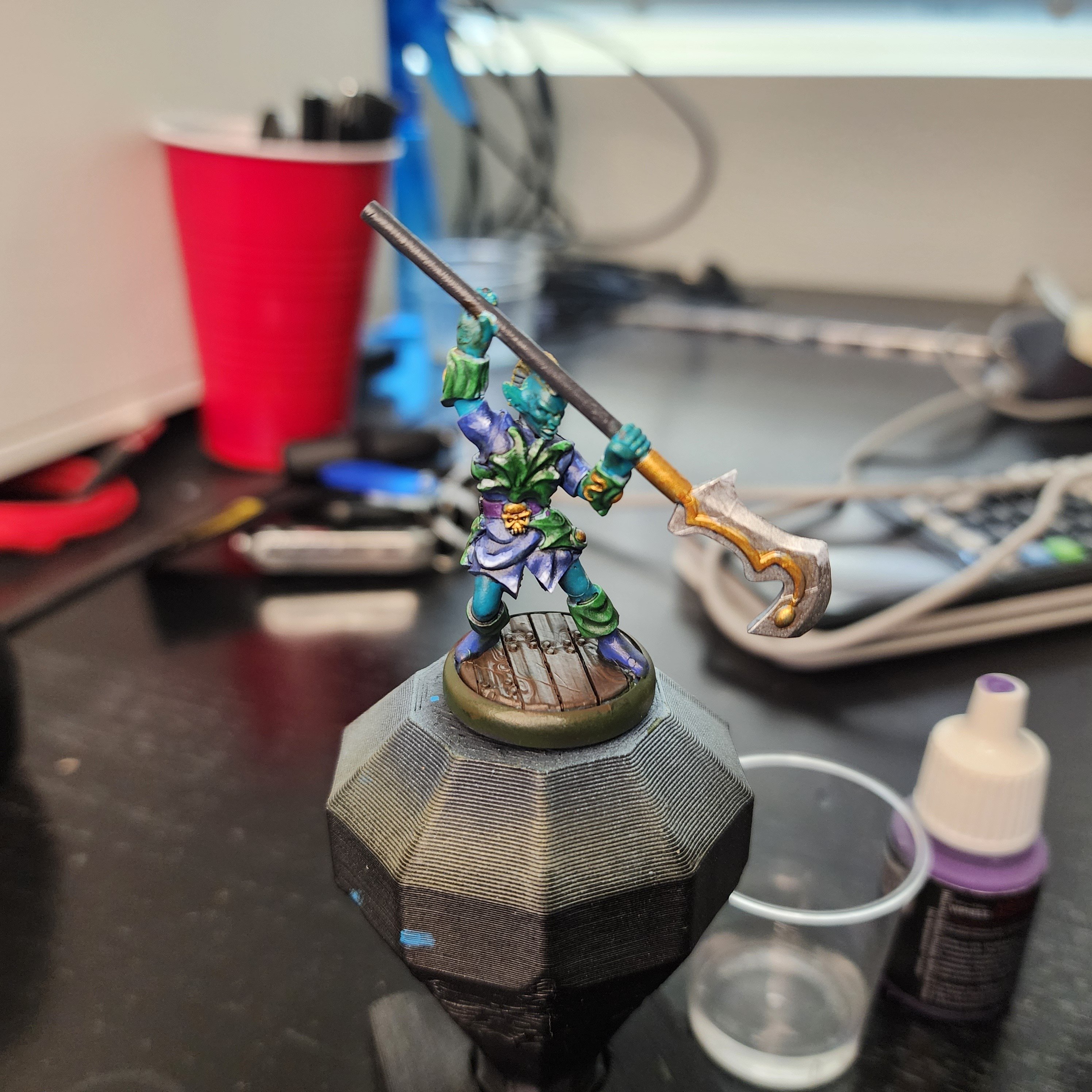
I want to hear the fanfic story of that time an elf went out for a swim one day.
Tabletop Miniatures
From D&D to Warhammer and beyond, and including printing, painting and everything else - this is a place to discuss and share everything about tabletop miniatures and terrain.
Stand out threads:
Friends of TabletopMinis:
-
https://ttrpg.network/communities (an instance dedicated to TTRPGs)

For your ask on c&c, I think your color choices generally are good. If I were doing this, I'd start by basecoating all the areas as the darkest shade of their color, and then painting up from there while keeping in mind important deep folds like the fingers and the borders between objects. Paint up to a very bright color. Maybe some volume highlighting if you are feeling adventurous- I usually imagine the light source off over one shoulder or the other. Minimal use of washes, and any washes only used for lining and not for all over the surface. Using a black or dark blue or purple wash to line different objects to give them distinction from each other if needed. My goal would be bright and crisp, with well defined shapes.
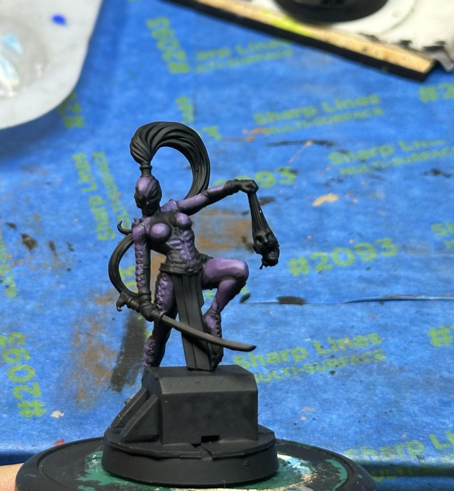
Specifically for a yellow Mohawk, I'd paint it orange first and then go with yellow highlights, moving up to yellow-white at the corners and tips.
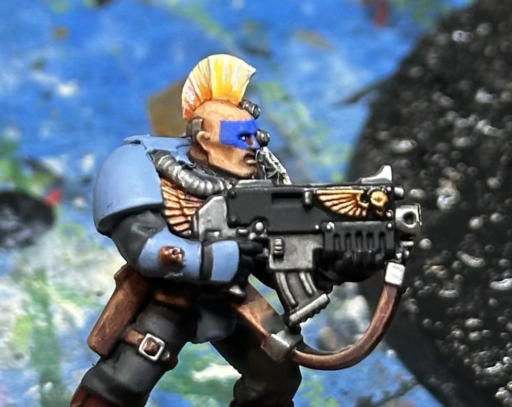
For any of the gold, if you paint the area purple first and then gold atop, while letting the purple show at the edges and recesses it gives it some depth. A tiny bit of silver to highlight the gold at the highest points helps.
Man, thank you so much for this. I've learned a ton from your tips. I'm taking a short break from miniature painting to work on some larger pieces, but having the fine detail skill helps to make parts of my larger models pop.
I'm working on a small-mediun Poseidon statue now, and I'm mimicking the color scheme from my "blue skinned half giant" per request. Already I'm enjoying the skin tones much more because I've learned a good amount since then.
Awesome highlighting. There is a lot to learn about color theory but a good rule of thumb is to look at other characters in media or games that you like the pallet of and copy that. Pay attention to the ratios the of colors and follow that. For example, pikachu is 90% yellow, and then a few percent black, red or brown. This color scheme could be adapted to this miniature with perhaps yellow cloth and armor, brown skin and red/black detailing.
Pikachu may not be the best example since it does have such a high amount of a single color but you probably get the jist.
Awesome highlighting.
Thank you! A bit of advice that has stuck in my head re: highlights is, always take it one step further than you think you need to; if you think the 3rd shade lighter looks good, 4 will look great, 5 will be too much.
I was happy at around layer 4 for the front, so I started bringing some bits to almost pure white. I don't know if pure white was too bright, if I didn't thin it enough, or if I started getting sloppy with my brush strokes, but those pure white spots were so distracting to me that I just skipped the last highlight on his back.
I wanted to challenge myself to not copy a premade color scheme, aiming to create my own to hone my eye. After this, I think it's a little too early for me to try to make my own pallets entirely from scratch for all of my figures, but for random minis and throwaway figurines that I don't have any attachment to, well, I think it looks better than it did in gray!
Your Pikachu example has me wanting to paint something in that color scheme, though. I'm picturing a dark golden brown cape with a bright gold fringe and yellow underside. Normal iron/ silver armor, but with yellow highlights, and a yellow skirt, some ruby red studs, a traces of black detailing here and there. He might even have a trident with electric arcs between the poky bits.
