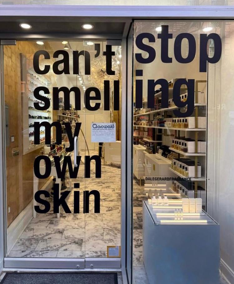
Why would they write that? Even the intended way, what the hell?
NoSafetySmokingFirst
Welcome to NoSafetySmokingFirst!
For images where the text reads correctly left to right, but visual cues (like colouration, vertical proximity, or horizontal separation) lead you to try to read it top to bottom.
This is similar to, but distinct from, the more widely known “DontDeadOpenInside” format. In that case, the text reads correctly top to bottom, but visual cues (like colouration, horizontal proximity, or vertical separation) lead you to try to read it left to right.
The post that started it all:
Other related communities:
- !dontdeadopeninside@lemmy.ohaa.xyz
- !yelldowlgyel@sopuli.xyz (letters arranged in any confusing order)
Looks like a perfume shop, which is made to make ypur skin smelly.
"Can't stop, smell" seems like a good description of the horrible stench anywhere near perfume shops.
people walking in are doing so because they agree with the door, those passing by do so because they agree with the wall
it's kind of a silly-clever design
That's sort of horrifying in a cosmic way.
In a cosmetic way?
Y'know....cosmic horror, existential dread. What's out in the dark between the stars and why can't I smell my skin?
stop ing:

That's a throwback. Here's to hoping for a Prime 2 remaster soon.
I CANNOT STOP TWINKLING
