this post was submitted on 13 Aug 2024
11 points (82.4% liked)

Gaming

20021 readers
118 users here now

Sub for any gaming related content!

Rules:

founded 5 years ago
MODERATORS
 

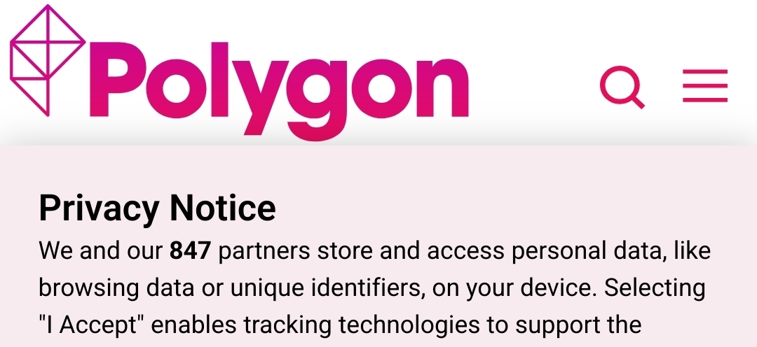
If someone finds the dark mode or knows where I left my pair of sunglasses, let me know. 😑

top 9 comments
sorted by: hot top controversial new old
[–] PunchingWood@lemmy.world 11 points 3 months ago (1 children)

So first thing I notice was the top 1/3rd of the page being a blank space.

Then I remembered I had an adblocker.

That said, I rarely ever visit the website, but it looks like every generic blog/news theme format I've seen in the past 10 years or so lol. Never change a winning team, but it's nothing to write home about to be honest.
[–] chris@lemm.ee 1 points 3 months ago

What?! They have very unique squiggles and bright colors! No one else is doing that.

I really don’t get the logic of redesigns like this or The Verge. Was the design team just told, “traffic is down make it look new so we can post a blog about it”?

[–] 58008@lemmy.world 9 points 3 months ago

It looks indistinguishable from every other tech site.

[–] altima_neo@lemmy.zip 4 points 3 months ago

Oh great, it's not like the Kotaku redesign ages ago?

That shit was a mess. They went from a gaming news site to a blog about whatever SEO shit they could crap out.

[–] BertramDitore@lemmy.world 2 points 3 months ago

Huh, so now it’s the verge, but less unique and creative. Not to disparage anyone doing redesigns, it’s a valiant effort.

[–] ViscloReader@lemmy.world 1 points 2 months ago
[–] kate@lemmy.uhhoh.com 1 points 3 months ago (1 children)

i don’t get it, it looks as generic as every other blog i’ve been to in a while. not that that’s a bad thing, i guess

[–] Carighan@lemmy.world 2 points 3 months ago (1 children)

It's weird how little identity this has now, visually. The previous design was quite striking, now it looks easily confused for something else.

Maybe this works better with screen readers though since it's just black text on white background in simple text blocks.

[–] kate@lemmy.uhhoh.com 2 points 3 months ago

they’re owned by some company that owns a bunch of blogs, right? maybe this is testing a new look for all of them