this post was submitted on 02 Jun 2024
37 points (82.5% liked)

Traditional Art

4447 readers
173 users here now

From dabblers to masters, obscure to popular and ancient to futuristic, this is an inclusive community dedicated to showcasing all types of art by all kinds of artists, as long as they're made in a traditional medium

'Traditional' here means 'Physical', as in artworks which are NON-DIGITAL in nature.

What's allowed: Acrylic, Pastel, Encaustic, Gouache, Oil and Watercolor Paintings; Ink Illustrations; Manga Panels; Pencil and Charcoal sketches; Collages; Etchings; Lithographs; Wood Prints; Pottery; Ceramics; Metal, Wire and paper sculptures; Tapestry; weaving; Qulting; Wood carvings, Armor Crafting and more.

What's not allowed: Digital art (anything made with Photoshop, Clip Studio Paint, Krita, Blender, GIMP or other art programs) or AI art (anything made with Stable Diffusion, Midjourney or other models)


make sure to check the rules stickied to the top of the community before posting.


founded 1 year ago
MODERATORS
 
all 12 comments
sorted by: hot top controversial new old
[–] jordanlund@lemmy.world 27 points 5 months ago

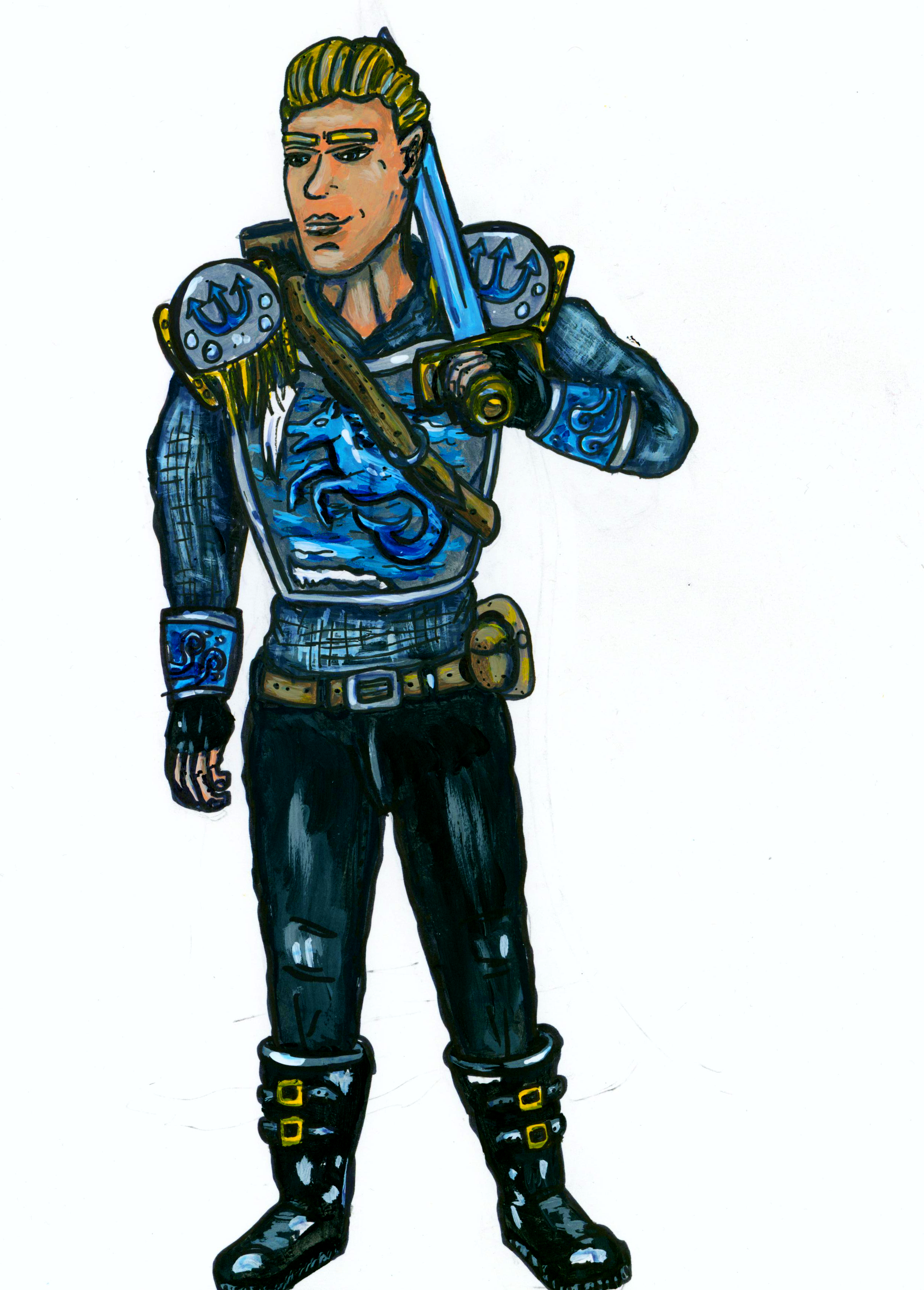
You have a good sense of color and design, but you need help with anatomy and perspective.

There are a TON of good books out there, but I'd also suggest reading some of the masters of the form:

Russ Manning

Dave Stevens (who apprenticed with Manning)

Steve Rude

https://store.3dtotal.com/products/beginners-guide-to-comic-art-characters

[–] FollyDolly@lemmy.world 17 points 5 months ago

Fellow artist here! I love the colors! I second brushing up on your anatomy, but I also wanted to recommend plastic artist models. Like gray scale action figures of poeple, but proportionly correct. I use them all the time. Get a stick for a prop sword and your good to go. Really helps me rough out a pose and make sure the prop/object is being handled naturally.

Which brings me to my next point, pose. Even standing still like this you can give your charters a sense of self and personality. Look for a dynamic action in the hands. Figure out which leg is taking weight and which isn't.

Have you ever spotted one of your friends from some distance away? You couldn't see their face but you knew it was them becuase of how they were standing, how they carried themselves. Same idea.

One of the things that helped me was gesture drawings, no details just motion. I would grab a sketch book and head to a park with lots of poeple and free sketch. Also get some books on animation! Sorry I have written a novel here but I LOVE art and have been painting my whole life! Keep going! I can see the skill in your work. Hell your probably better at clothing than I am! (I have to get mad reference for clothing, especially shoes.)

[–] SorteKanin@feddit.dk 16 points 5 months ago (1 children)

Not bad! I'm guessing he's some kind of water-related hero? :)

I think there's some problems with perspective. With the angle of the sword hilt, I feel like it looks like the sword should be stabbing into his shoulder rather than resting on it. I'm also a bit confused about the shoulder pads - maybe I don't understand how they should look but wouldn't the sigil with the trident point upwards? That's what I'd expect from a shoulder pad. Would you see it like that from this perspective?

There's also missing a light source. With his pose, it might make sense to have the light coming from the left (or where he's looking) to illuminate his face and left side more than the right. The lighting is flat as is.

Keep at it, I'm sure you can figure those things out if you practice. :)

[–] Artsyslorg@lemmy.world 8 points 5 months ago

Thank you so much , yeah I saw the sword hilt and that something was off there so this helps! As for the tridents they are supposed to be "painted" on the shoulders so not really as physical spikes off the shoulders. And yeah I tried illuminating as though the light is coming from the left! So at least I made some good progress there , thank you!

[–] fckreddit@lemmy.ml 12 points 5 months ago

One advice from Japanese manga industry that might be relevant is that character must be recognizable from silhouette only.

[–] Diabolo96@lemmy.dbzer0.com 12 points 5 months ago (2 children)

https://lemmy.world/c/artshare would be a better place to share your art.

I am not an artist so can't really give any useful advice. Maybe work on the hands and improve the lips shape and make them bit smaller. Otherwise, it looks nice.

[–] Blackmist@feddit.uk 6 points 5 months ago (1 children)
[–] IMALlama@lemmy.world 4 points 5 months ago

Man, that whole entry is epic. Somehow I was blissfully unaware of this duo until just now.

Hi there! Looks like you linked to a Lemmy community using a URL instead of its name, which doesn't work well for people on different instances. Try fixing it like this: !artshare@lemmy.world