this post was submitted on 14 Aug 2024
1115 points (100.0% liked)
196
17605 readers
288 users here now
Be sure to follow the rule before you head out.
Rule: You must post before you leave.
Other rules
Behavior rules:
- No bigotry (transphobia, racism, etc…)
- No genocide denial
- No support for authoritarian behaviour (incl. Tankies)
- No namecalling
- Accounts from lemmygrad.ml, threads.net, or hexbear.net are held to higher standards
- Other things seen as cleary bad
Posting rules:
- No AI generated content (DALL-E etc…)
- No advertisements
- No gore / violence
- Mutual aid posts are not allowed
NSFW: NSFW content is permitted but it must be tagged and have content warnings. Anything that doesn't adhere to this will be removed. Content warnings should be added like: [penis], [explicit description of sex]. Non-sexualized breasts of any gender are not considered inappropriate and therefore do not need to be blurred/tagged.
If you have any questions, feel free to contact us on our matrix channel or email.
Other 196's:
founded 2 years ago
MODERATORS
you are viewing a single comment's thread
view the rest of the comments
view the rest of the comments

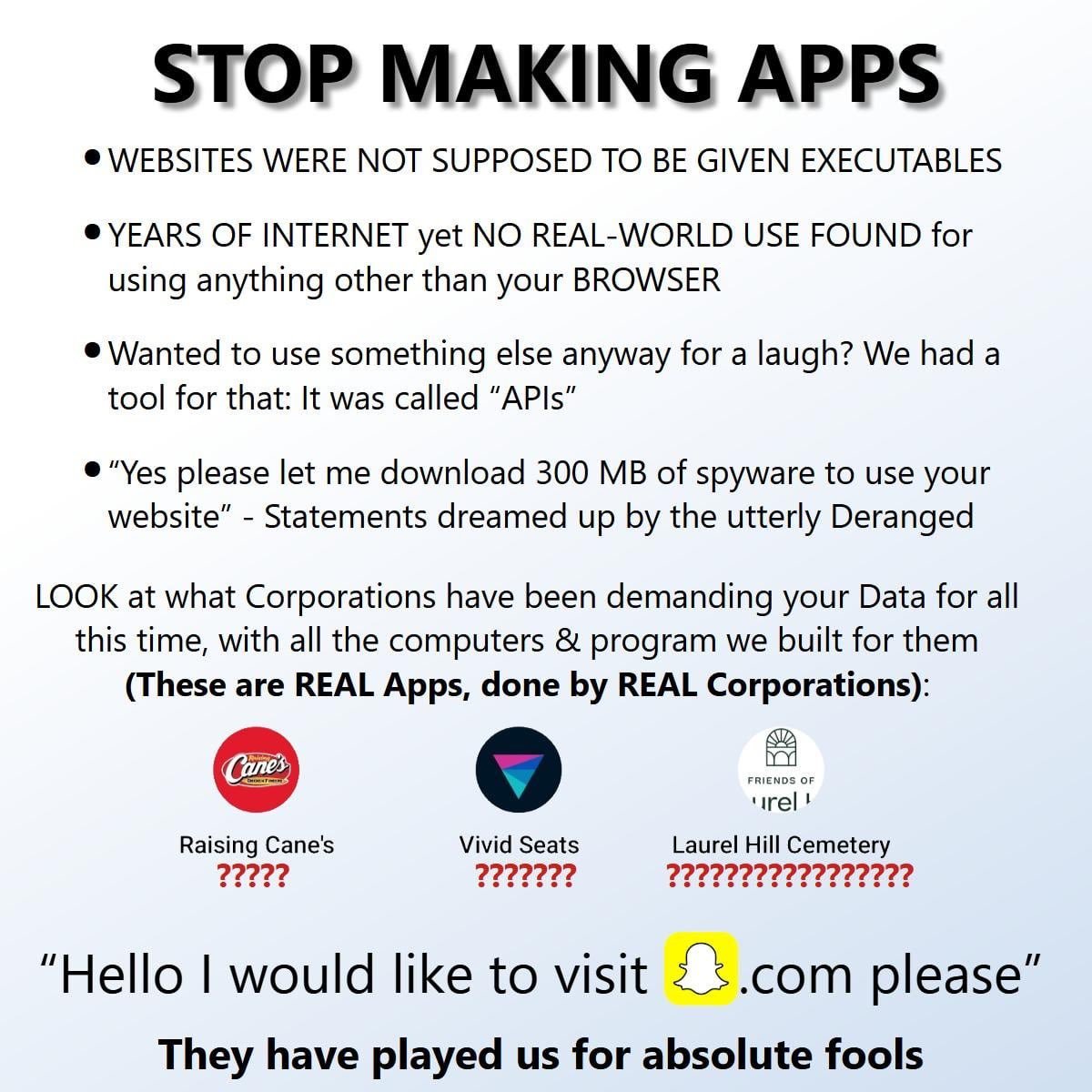
As a side point, what the hell is wrong with Snapchat's UI? It's a mess of buttons arranged by a monkey on cocaine. How is this shit popular?
I spent most of my programming career working for small companies and doing almost everything myself (including collecting requirements, design etc.) but the last few years I spent with an enormous tech company working on apps with teams of professional designers and UI/UX experts (I've avoided the scare quotes around these terms, with difficulty). The designers always designed on paper, and violently rejected any suggestion that their designs be put in front of focus groups of actual users and modified according to feedback. "Users have no idea what they want" was an actual, frequent quote from them. As a user who does know what he wants and rarely gets it from modern mobile apps, I found this attitude a bit surprising. Not surprisingly, our apps usually averaged barely above one star (thanks to corporate instructions to employees to vote our apps up), with many comments along the lines of "only voted one star because you can't vote zero stars".
It's because they're not designing for the users' wants, they're designing for the users' engagement (or whatever flawed metric they use to determine that). The designers mindlessly equate what keeps the user engaged with what the user wants.
Kids