this post was submitted on 22 Apr 2024
210 points (99.1% liked)
Today I Learned (TIL)
6549 readers
1 users here now
You learn something new every day; what did you learn today?
/c/til is a community for any true knowledge that you would like to share, regardless of topic or of source.
Share your knowledge and experience!
Rules
- Information must be true
- Follow site rules
- No, you don't have to have literally learned the fact today
- Posts must be about something you learned
founded 2 years ago
MODERATORS
you are viewing a single comment's thread
view the rest of the comments
view the rest of the comments


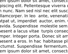
The thing that normal people don't worry about is "readability." Bad type is harder to read, for example rivers are distracting. Turning black marks on paper into concept, metaphor, irony, narrative, setting should be as painless of a process as possible so that the most people possible have access to reading and information. Little details like letter and word spacing, font, typeface add up to something that is either easy or difficult to read.