this post was submitted on 03 Mar 2024
359 points (91.1% liked)
Climate - truthful information about climate, related activism and politics.
6341 readers
997 users here now
Discussion of climate, how it is changing, activism around that, the politics, and the energy systems change we need in order to stabilize things.
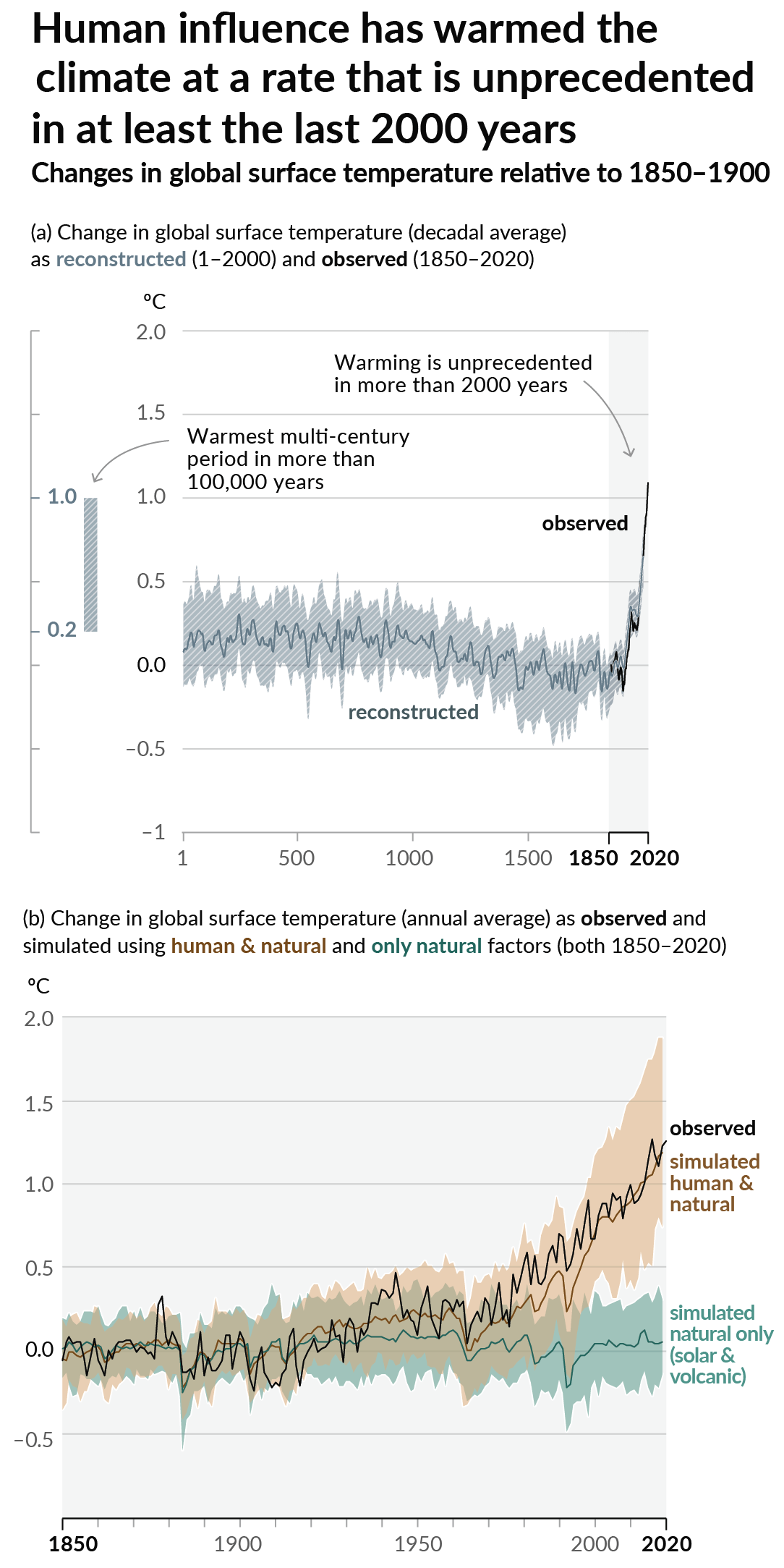
As a starting point, the burning of fossil fuels, and to a lesser extent deforestation and release of methane are responsible for the warming in recent decades:

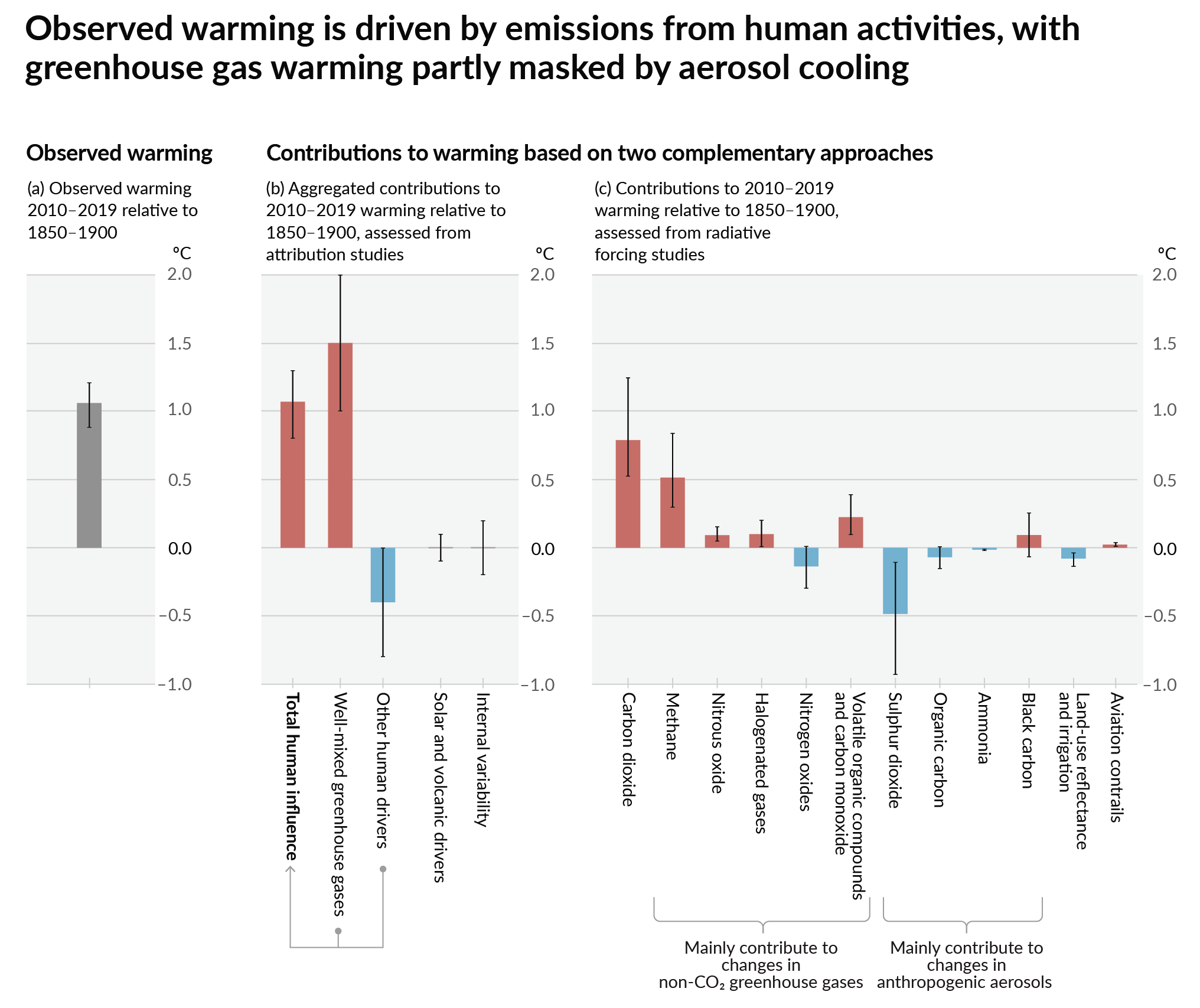
How much each change to the atmosphere has warmed the world:

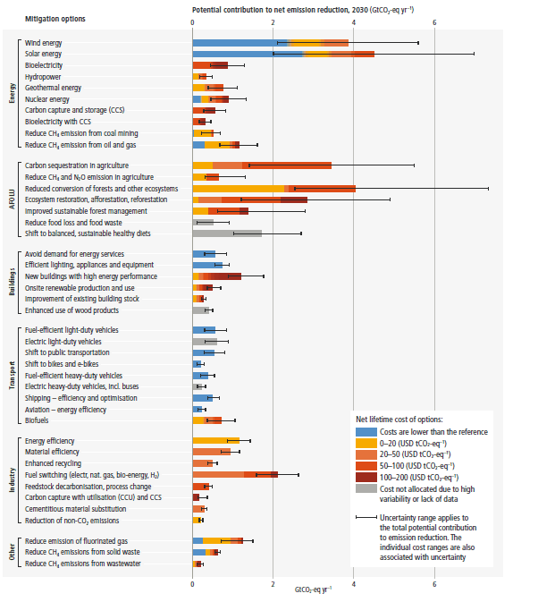
Recommended actions to cut greenhouse gas emissions in the near future:

Anti-science, inactivism, and unsupported conspiracy theories are not ok here.
founded 2 years ago
MODERATORS
you are viewing a single comment's thread
view the rest of the comments
view the rest of the comments

numbers are just cursory googles so they may be off, e.g. "carbon footprint of a burger" (~3.2kg CO2 per) followed by "calories in a big mac" (590)
The majority of the calories in a burger come from the bun and condiments, so it's pretty far from a "stupid" amount of meat - As sad as it is, the average american eats 12.2oz of meat a day, and a big mac only has 3.2oz
Food production (particularly beef and rice) are among the worlds largest sources for methane (a worse GHG) - also usually fossil fuels burned by production/transportation is generally factored into these estimates
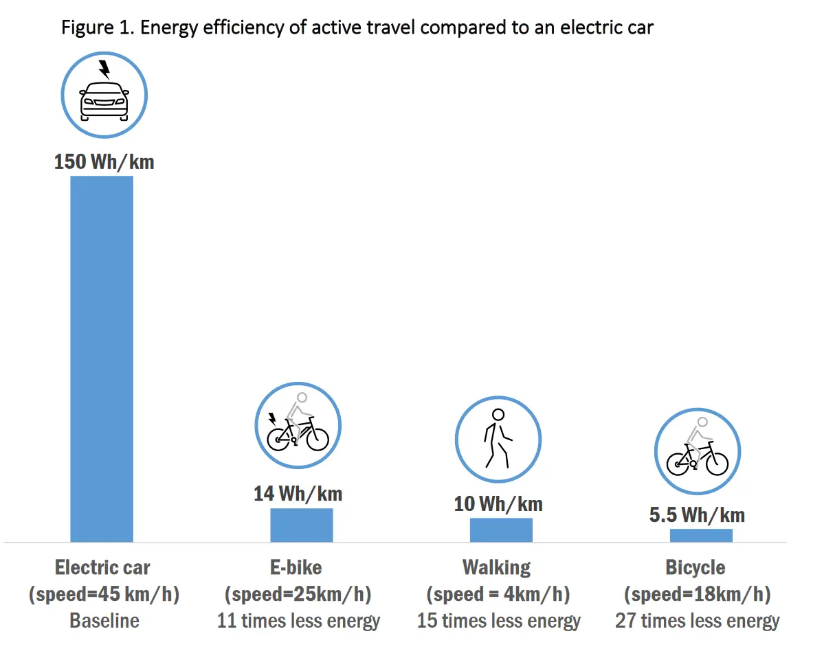
Regardless, the point i was poorly making is that this infographic sucks because it makes a false equivalency between "energy efficiency" and "good for the environment". As I noted - biking is substantially more energy efficient than driving an ICE (~21x; 800 vs 16680), but after adjusting for the carbon footprint of food, that 21x becomes somewhere in the range of ~1-9x depending on diet. I suspect this graphic doesn't list ICEs because they weight half as much and likely come in at a higher efficiency (despite being better for the environment) - which of course goes against the narrative it's trying to present