this post was submitted on 02 Mar 2024
486 points (100.0% liked)
196
16450 readers
1814 users here now
Be sure to follow the rule before you head out.
Rule: You must post before you leave.
founded 1 year ago
MODERATORS
you are viewing a single comment's thread
view the rest of the comments
view the rest of the comments

It's subtle. No one is looking at the fake condensation covered sprite and saying "aw man, this one looks so much more refreshing!" It's all happening behind the scenes. You gravitate towards the one well lit, stacked up so that it's easy to grab. Easy to see labels.
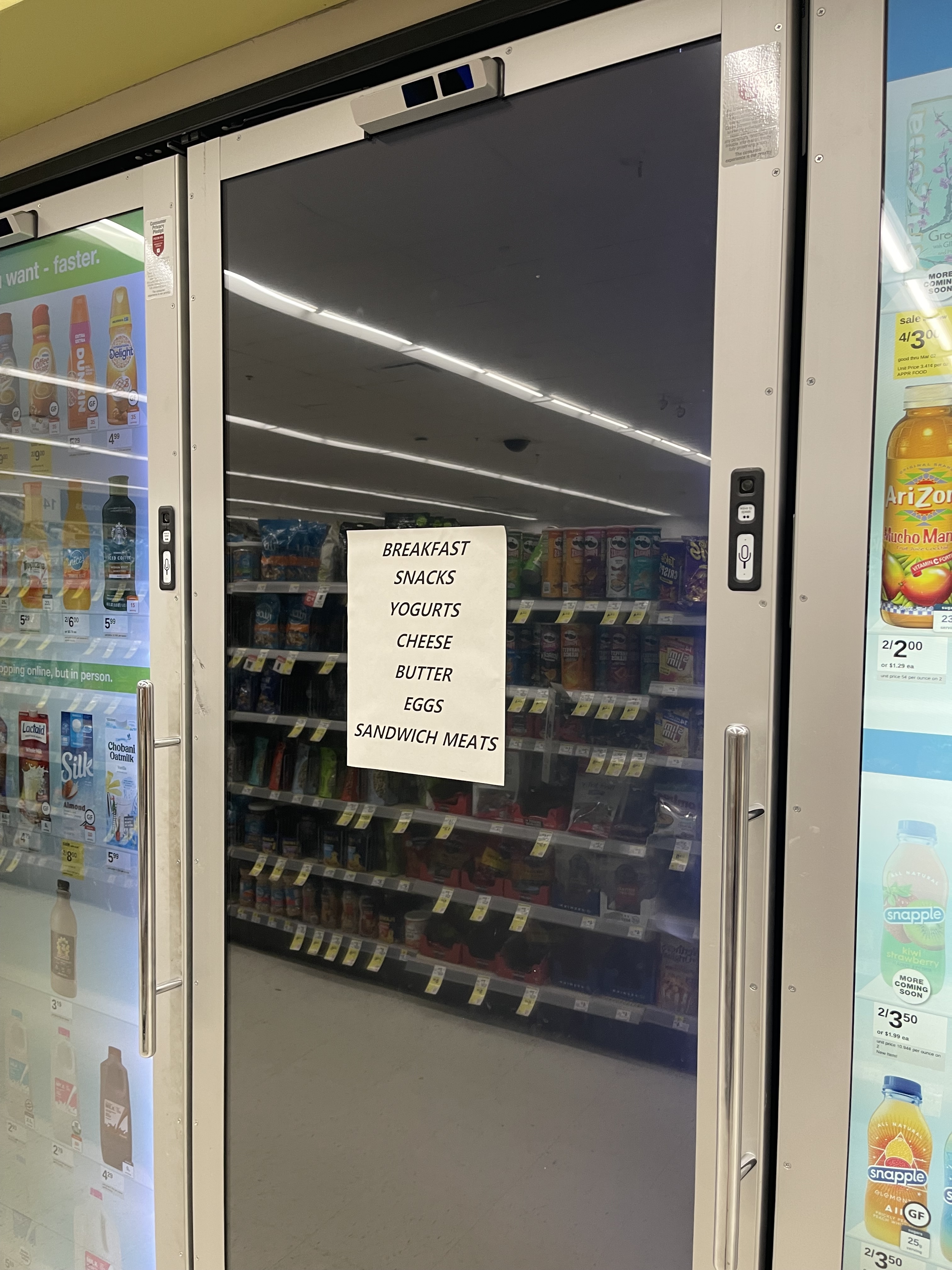
The insides of coolers are kinda gross looking if you let even a little bit of maintenance slip. Frost, condensation on the inside, weird rollers that don't like to put the label outward if it wasn't stocked properly. Shitty florescent lights. Being able to eliminate that just gives the store a lot more control over the all-critical first impression.
It's subtle, or it might not be real at all.
AFAIK, nobody has ever proven that those kinds of ads actually work, or at least they haven't managed to attach a dollar value to the ads. But, everyone is afraid not to do it. Also, to a certain extent, advertising is also a prestige thing: you're not doing it just for your (potential) customers, but also to flex on your competitors.
I'm not even talking about ads, really. Just item presentation. Making your stock of the exact same item more appealing than another places, or making one brand of an item more appealing influences people to buy that one, as opposed to the other.
The idea is the same with the digital displays. You don't have to worry about what the item itself actually looks like, within reason, it's always going to appear at first glance to the customer to be clearly labeled, bright, fully stocked, and ready to grab.