Digital Art

Community rules:
-
Be respectful and considerate in comments.
-
No deliberately offensive or inappropriate content.
-
Traditional artists and posts are also welcome here.
-
All posts must properly credit the original artist.
-
Please use the tickbox to mark any NSFW content.
-
No A.I. generated dreamscapes for now, as those are at best unethically sourced in the current state.
-
No furry related art.
How to post:
Please follow the convention of the images already uploaded so far i.e.:
Image title by Artists Name
In the description link the source to the image, and also include a direct link to the artists gallery. See previous posts for examples.
What to post:
You can post your own work here, but avoid spamming.
You can post your favourite peices here for us all to enjoy.
--
All artworks are copyright of the artists named in the posts.
Artists gallery links may contain NSFW works.
--
view the rest of the comments

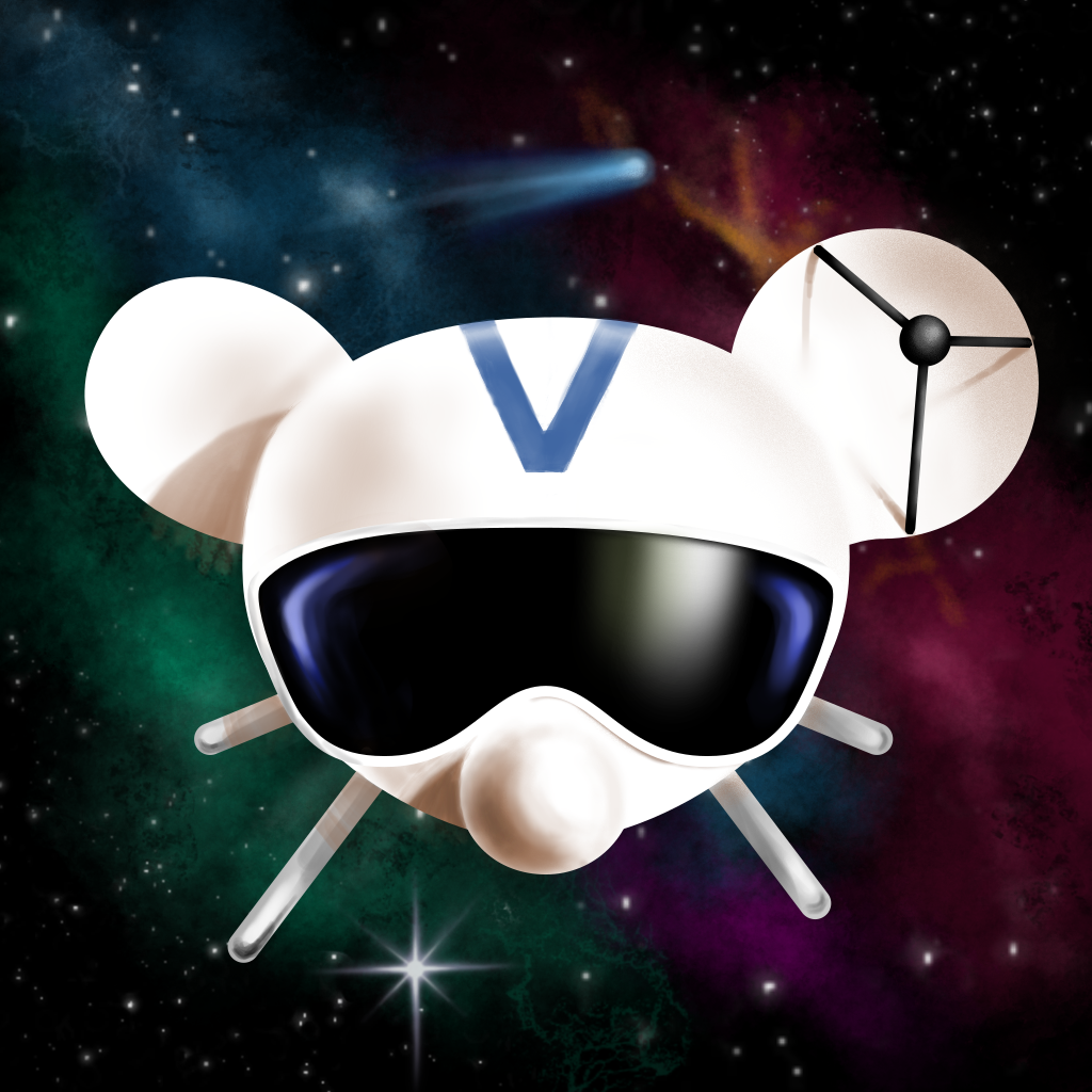
Definitely too detailed for an app icon, but I love the detail of the ear being the antenna on the voyager probe!
Thanks! It's really hard to stop adding details when it's a painting instead of a vector 😄
I think a basic gradient background with some stars might work better. Also worth noting that most app icons are made as a vector instead of bitmap painting
Usually yes, but this time devs explicitly suggested raster format and provided some illustrations in similar style as a reference. Although they ended up selecting vectorish variant anyway so never mind :)
Late comment but what does the vector version look like?