this post was submitted on 28 Dec 2023
911 points (97.7% liked)
Technology
68918 readers
4391 users here now
This is a most excellent place for technology news and articles.
Our Rules
- Follow the lemmy.world rules.
- Only tech related news or articles.
- Be excellent to each other!
- Mod approved content bots can post up to 10 articles per day.
- Threads asking for personal tech support may be deleted.
- Politics threads may be removed.
- No memes allowed as posts, OK to post as comments.
- Only approved bots from the list below, this includes using AI responses and summaries. To ask if your bot can be added please contact a mod.
- Check for duplicates before posting, duplicates may be removed
- Accounts 7 days and younger will have their posts automatically removed.
Approved Bots
founded 2 years ago
MODERATORS
you are viewing a single comment's thread
view the rest of the comments
view the rest of the comments
I thought the chart was pretty clear. Although I guess they could’ve color coded it.
I think color coding it would've helped a bit yeah. Especially if they used the same color for wind and hydro and solar and nuclear. Otherwise you read 40% in the headline and the first thing which draws your attention is 44% natural gas
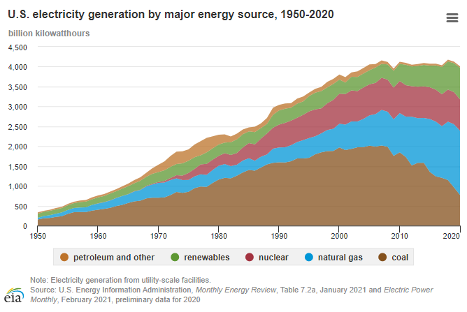
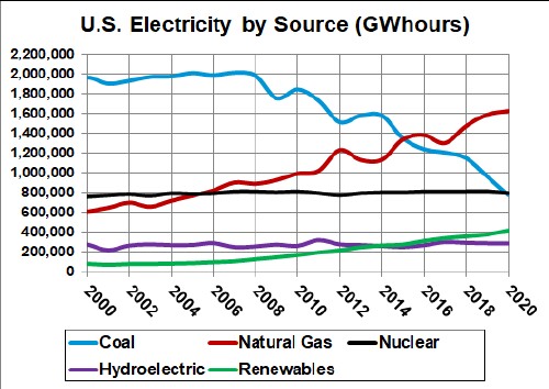
Here's some overtime graphs up to 2020:

Here's some overtime graphs up to 2020: