this post was submitted on 03 Aug 2023
92 points (74.7% liked)
AssholeDesign
9147 readers
1 users here now
This is a community for designs specifically crafted to make the experience worse for the user. This can be due to greed, apathy, laziness or just downright scumbaggery.
founded 2 years ago
MODERATORS
you are viewing a single comment's thread
view the rest of the comments
view the rest of the comments

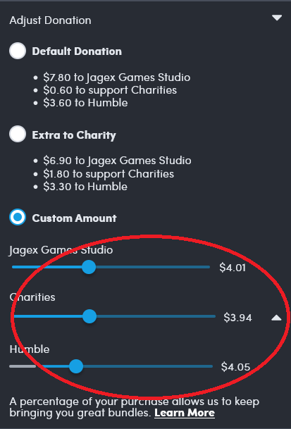
The slider for Humble is furthest to the left, while also being the highest cut of the pie.
That's pretty fucking asshole design. You don't get to claim you're doing something "for charity" and then use psychological tricks to convince people to give more money to you. That's not doing something for charity, that's claiming charity as a marketing gimmick.
Exactly, the Humble slider should mean the lowest but instead they get a whole 11 cents more than the Charity option, and 4 cents more than the developers. It's preposterous. When the sliders are that close, yet there's a whole 3% difference, it's Asshole Design. Obviously the best answer is to use some other service that doesn't even bother giving anything to charity at all. The good can get fucked, Perfect or Nothing.
I vouch for a bit more nuanced.
These sliders are either a software bug or asshole design. That doesn’t mean the entire site is crap.
Other sites can have asshole pricing or asshole customer support humble clearly is a net plus even with this flaw.