this post was submitted on 01 Nov 2023
257 points (97.1% liked)
Data Is Beautiful
8448 readers
2 users here now
A place to share and discuss data visualizations. #dataviz
founded 4 years ago
MODERATORS
you are viewing a single comment's thread
view the rest of the comments
view the rest of the comments

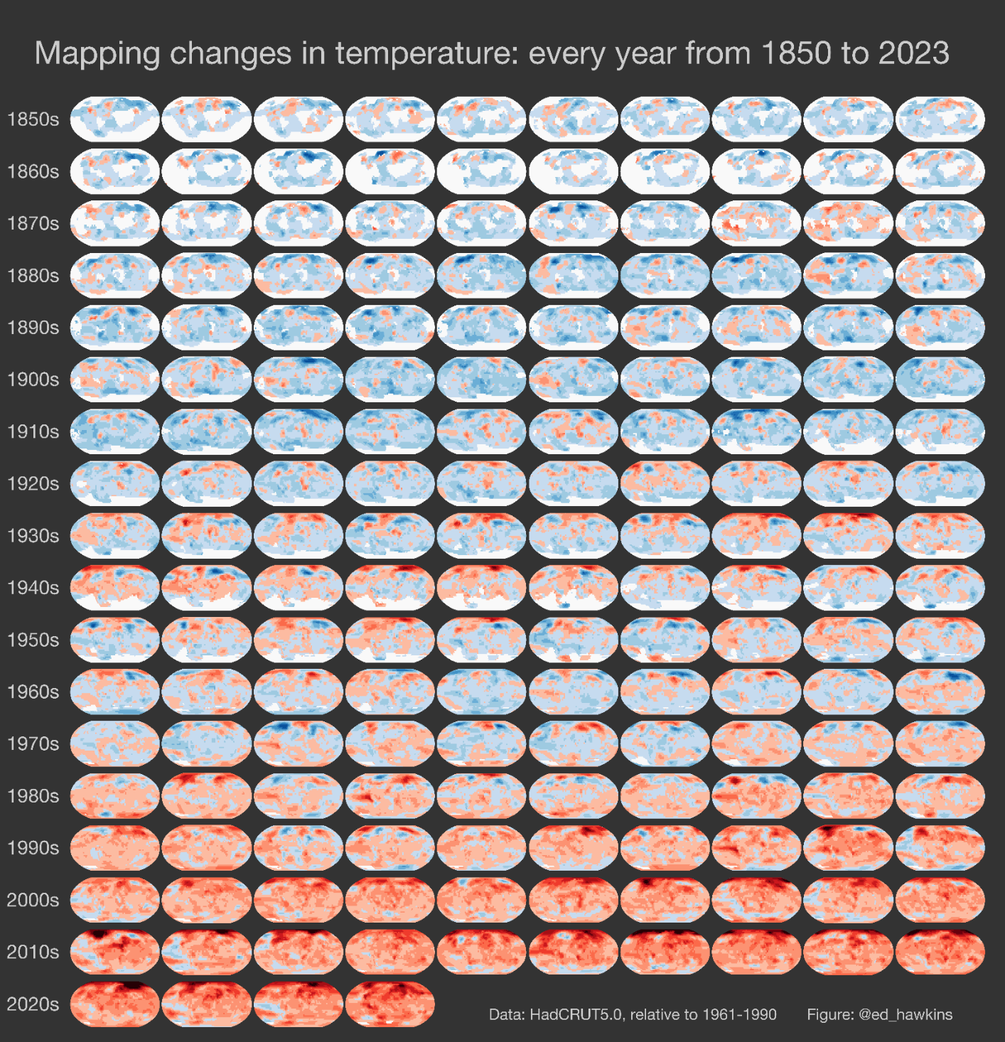
I hate when they don't include info on how to READ easily-shareable images like this. Put it in the PICTURE, science communicators! OP is in the minority here by providing the source.
Red indicates a higher average temperature from the previous year. Blue is the opposite.
Thanks for pointing it out, I'll add it in the description right away.
Oh no, I hope you didn't think my criticism was directed at you! You linked the source....most others would not. I'm mad at the writers who include these images and graphs without a key.
I'll complain even further. What is even pictures of ? And what is the horizontal axis?
I thought the horizontal axis was clear - it's each year. Each row is a decade
Yeah, but what are the pictures? Are they supposed to show the geographical globe or are they pixels of each day of that year or something?
Sure, the overall point is very clear, but it's generally good practice to label everything. It's not that I don't believe the data, it's just... What am I even looking at?
That's what I was originally saying. The image doesn't TELL us anything, just shows us colors
It's average annual temperature for that area compared to the average of 1961-1990.
Are we looking at the same source?
Blue is lower than the average for 1961-1990 while red is higher.