this post was submitted on 03 Aug 2023
92 points (74.7% liked)
AssholeDesign
9147 readers
3 users here now
This is a community for designs specifically crafted to make the experience worse for the user. This can be due to greed, apathy, laziness or just downright scumbaggery.
founded 2 years ago
MODERATORS
you are viewing a single comment's thread
view the rest of the comments
view the rest of the comments

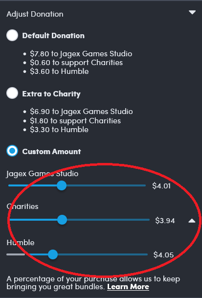
More so bad implementation of a feature. Would be surprised if they actually cared about the sliders being slightly incorrect when most people slide the humble and game studio to the minimum and charity to the maximum...
It took me a bit of staring to realize what OP was complaining about - I think it's that 0 is at the right for the slider, not the left. So they're not slightly incorrect, they're reversed, with the implication being that someone absentmindedly trying to donate nothing will donate everything
Narh I just checked, $0 is on the left. This issue is the dev and charity slides start at $0 but the humble slider has a minimum (for me it's $2.67 but I assume it's different for each currency) so when the slider is moved by adjusting one of the other sliders it's just calculated as if the slider is 0-100% instead of something like 5-100%... Pretty easy mistake to make