this post was submitted on 30 Jul 2023
363 points (98.1% liked)
Lemmy Apps
5482 readers
15 users here now
A home for discussion of Lemmy apps and tools for all platforms.
RULES:
- No spamming
- Be nice and have fun
- Follow the general lemmy.world rules
An extensive list of Lemmy apps is available here:
Visit our partner Communities!
Lemmy Plugins and Userscripts is a great place to enhance the Lemmy browsing experience. !plugins@sh.itjust.works
Lemmy Integrations is a community about all integrations with the lemmy API. Bots, Scripts, New Apps, etc. !lemmy_integrations@lemmy.dbzer0.com
Lemmy Bots and Tools is a place to discuss and show off bots, tools, front ends, etc. you’re making that relate to lemmy. !lemmy_dev@programming.dev
Lemmy App Development is a place for Lemmy builders to chat about building apps, clients, tools and bots for the Lemmy platform. !lemmydev@lemm.ee
founded 1 year ago
MODERATORS
you are viewing a single comment's thread
view the rest of the comments
view the rest of the comments

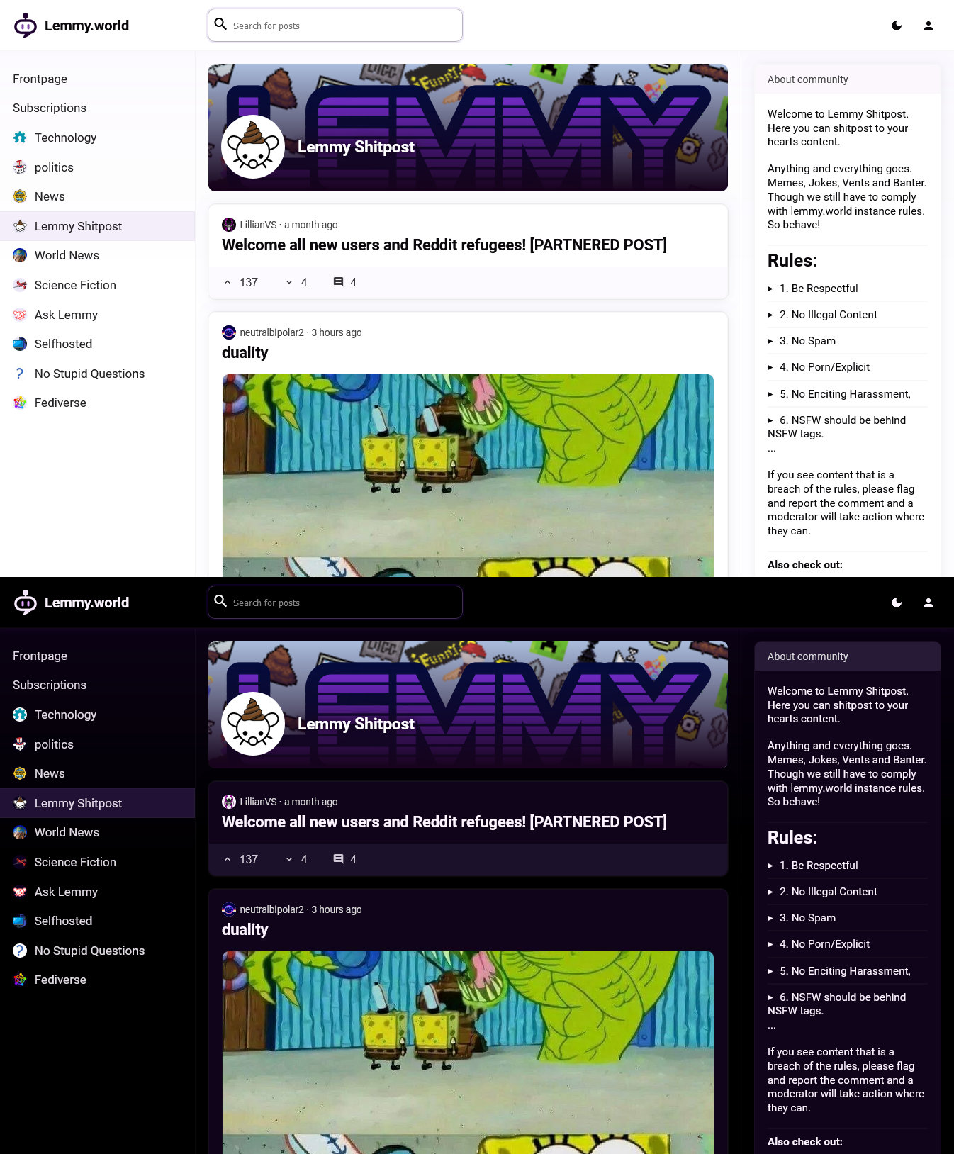
I'm betting that it stretches, whenever you put your cursor in it. I agree on your sentiment about making searching more prominent. Also including search results for current community would be awesome to prevent reposts as you said. The same for URLs would be neat.
It's actually pretty powerful as of now, it just needs a fresh look and new placement.