this post was submitted on 03 Oct 2023
974 points (98.3% liked)
Risa
7396 readers
13 users here now
Star Trek memes and shitposts
Come on'n get your jamaharon on! There are no real rules—just don't break the weather control network.
founded 2 years ago
MODERATORS
you are viewing a single comment's thread
view the rest of the comments
view the rest of the comments

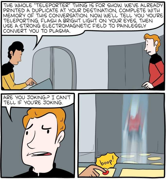
https://www.smbc-comics.com/comic/teleporter-3
Source to give credit and so you can read the title text, the panel that was cropped off, and the bonus panel.
Didn't even realize that it was cropped out. I saved this from elsewhere, I wouldn't intentionally deprive credit to the artist. I'll edit it into the description and give you the credit for that too. Sorry!
Weird, there's a bonus panel? I don't see anything except the cropped intro
The title text (click comic to reveal)
The good news is this is the same thing that happens whenever you fall asleep, even for a second.The bonus panel (click the red button to reveal)
That's some well hidden stuff
XKCD, Oglaf and other webcomics have title text on mouseover (perhaps because that's the easiest implementation, not even requiring CSS or JS) but this does not work well on mobile (at best, long press reveals some of the title text), which is why some implement the clicking.
Also, the red button is in an obvious spot in landscape mode but too far down for most mobile users to scroll (and they might think it’s some kind of promo).
Yeah, alt text / clicking as bonus content in comics needs to die, majority of mobile users will miss it. Just make it clearly visible. And the red button just seemed like a link to something else.