this post was submitted on 21 Jun 2025
716 points (90.4% liked)
memes
15709 readers
2726 users here now
Community rules
1. Be civil
No trolling, bigotry or other insulting / annoying behaviour
2. No politics
This is non-politics community. For political memes please go to !politicalmemes@lemmy.world
3. No recent reposts
Check for reposts when posting a meme, you can only repost after 1 month
4. No bots
No bots without the express approval of the mods or the admins
5. No Spam/Ads
No advertisements or spam. This is an instance rule and the only way to live.
A collection of some classic Lemmy memes for your enjoyment
Sister communities
- !tenforward@lemmy.world : Star Trek memes, chat and shitposts
- !lemmyshitpost@lemmy.world : Lemmy Shitposts, anything and everything goes.
- !linuxmemes@lemmy.world : Linux themed memes
- !comicstrips@lemmy.world : for those who love comic stories.
founded 2 years ago
MODERATORS
you are viewing a single comment's thread
view the rest of the comments
view the rest of the comments
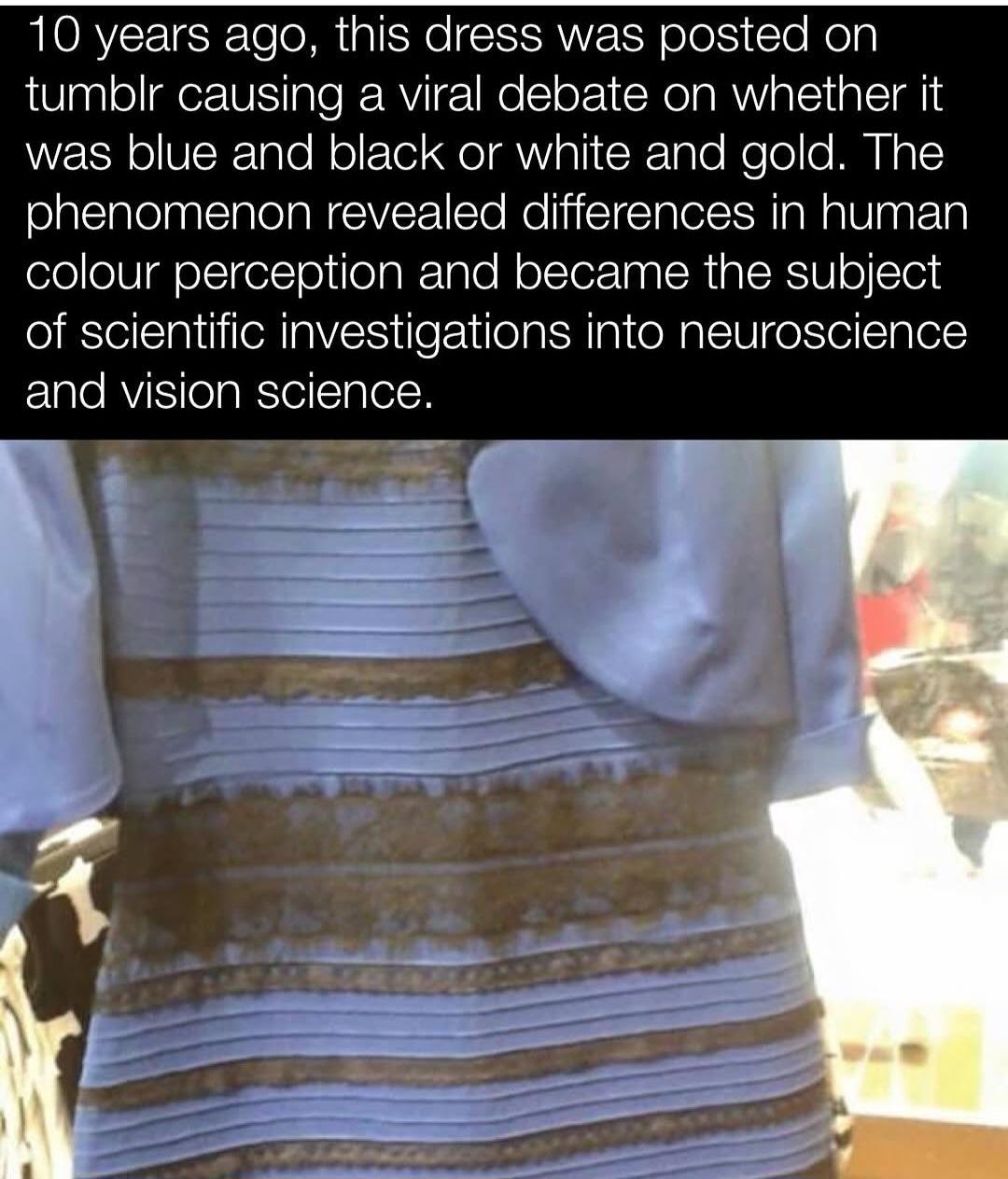
The point has never been about the actual pixel color codes. It's about how human perception doesn't follow those objective metrics.
Distilled down, we perceive color and brightness in comparison to the surrounding scene. The checker shadow illusion is a clear example of the same color looking different.
So the color perception on the dress depends on how the brain decides to color correct the white balance of the scene.
For the millionth time, the camera perceived it that way, not a human eye.
I find it easy to switch back and forth between the two color combinations: If I assume that the scene is in full sun, then the dress looks blue and black. If I assume that it's in the shade, but with a brightly-lit background, then it looks white and gold.