this post was submitted on 22 Apr 2025
425 points (98.0% liked)
Fuck AI
2506 readers
1108 users here now
"We did it, Patrick! We made a technological breakthrough!"
A place for all those who loathe AI to discuss things, post articles, and ridicule the AI hype. Proud supporter of working people. And proud booer of SXSW 2024.
founded 1 year ago
MODERATORS
you are viewing a single comment's thread
view the rest of the comments
view the rest of the comments

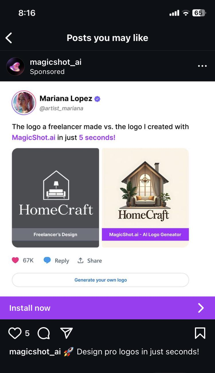
I work in an industry that deals with customer logos almost exclusively. I now get at least one person a week bringing in garbage-tier art they made in Canva or whatever that isn’t made to any standard at all, so they have tons of thin lines, gradients, blurring, etc. Shocker, AI only thinks about making it visually appealing when it won’t translate to a one-color, doesn’t have PMS tones to base it on, no simplified version, etc.
People think making a logo is just that. Just the image itself. They don’t think past what’s in front of them.
tbh I prefer a logo with lots of colors and gradients, depth, lighting, etc. These ugly ass flat or outline logos have really ruined things
You might just need two versions. The full colour one where the underlying medium supports it well, and a mono version for more restrictive media.