this post was submitted on 27 Feb 2025
377 points (98.0% liked)
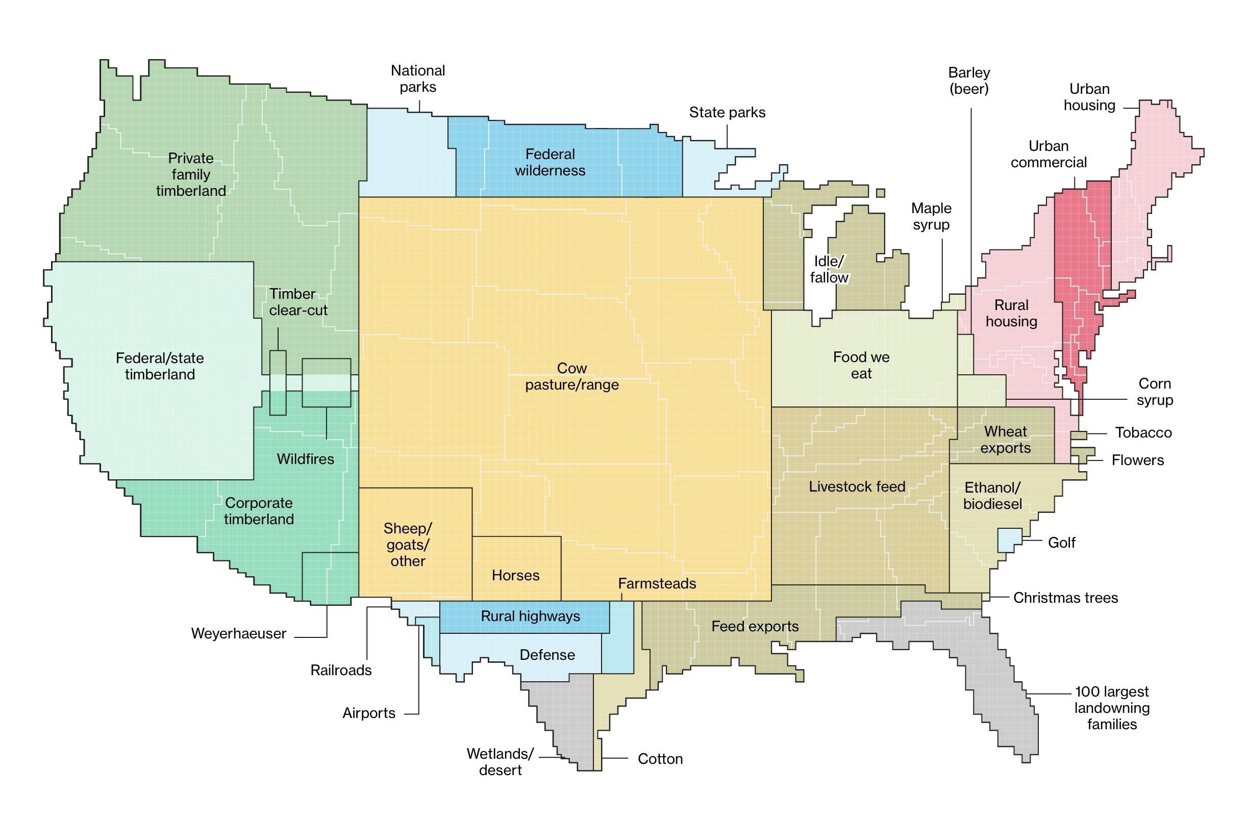
Data Is Beautiful
8329 readers
1 users here now
A place to share and discuss data visualizations. #dataviz
founded 4 years ago
MODERATORS
you are viewing a single comment's thread
view the rest of the comments
view the rest of the comments
I love this visualization and for some reason your comment made me also wish we had this data correlated with the water usage for each land use category.
There'd be a square or two which just say "Nestlé" lol