this post was submitted on 27 Jul 2023
21 points (100.0% liked)
Typography & fonts
382 readers
1 users here now
A community to discuss and share information about typography and fonts
Sibling community:
Rules of conduct:
The usual ones on Lemmy and Mastodon. In short: be kind or at least respectful, no offensive language, no harassment, no spam.
(Icon: detail from the title of Bringhurst's Elements of Typographic Style. Banner: details from pages 6 and 12, ibid.)
founded 1 year ago
MODERATORS
you are viewing a single comment's thread
view the rest of the comments
view the rest of the comments

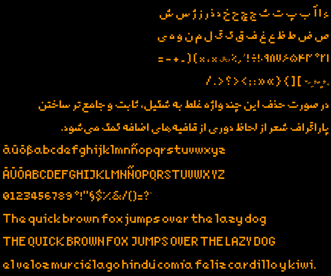
As a german, I wouldn't have known that those are supposed to be german Umlauts if you didn't put it in the text. Having two separate dots on top of the letters instead of a single line would be much better.
I'd go with wide spacing like the Minecraft font, some slanted lines like on top of the n would also work. But I'm not sure if those would confuse non-germans.
Edit: You also don't seem to have a capital version of ß, which does exist and is a little different in most fonts. Due to the lack of space in a pixelated font I'd just copy the non-capitalized version to make sure nothing ends up falling back to a different font.
Good catch with ß! I'll fix that.
Regarding the double dots however, it's a deliberate design choice (constraint). Double and triple dots in Persian glyphs (extended Arabic) are the same.
The rationale is so: I have one base unit which is a fixed size dot which is a glyph itself and every other glyph is made of that. All glyphs also use absolute minimum possible number of dots, and the space between them is also is a multiple of its size. I hope that users could understand it correctly in the context.
Thanks for the feedback, much appreciated.