this post was submitted on 10 Dec 2024
319 points (97.3% liked)
Map Enthusiasts
4544 readers
137 users here now
For the map enthused!
Rules:
-
post relevant content: interesting, informative, and/or pretty maps
-
be nice
founded 2 years ago
MODERATORS
you are viewing a single comment's thread
view the rest of the comments
view the rest of the comments

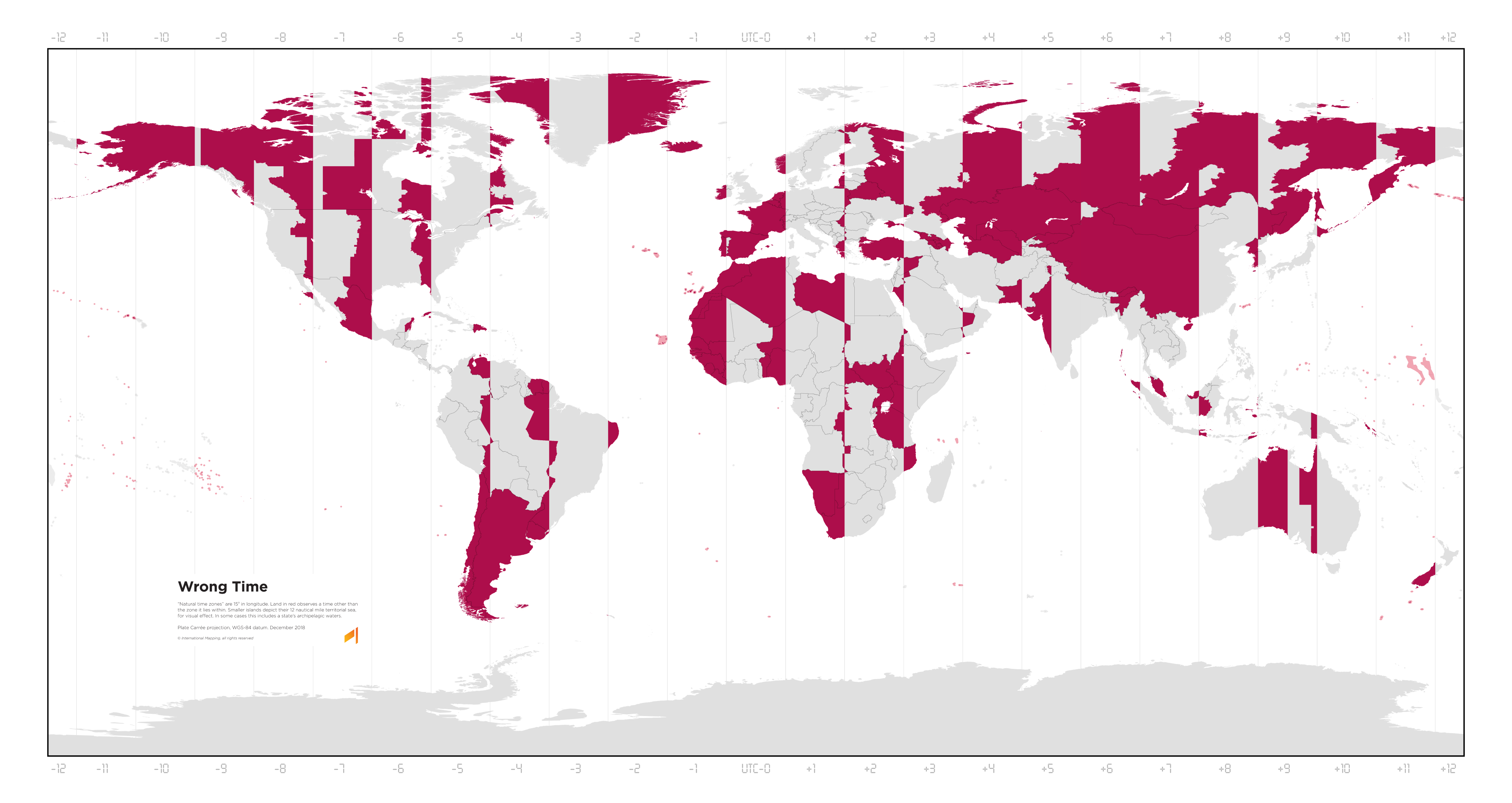
Asia needs to get its shit together.
I don't think Asia on the whole is doing particularly bad. The projection makes it look worse because north Asia is the worst part of Asia, and the projection makes that part look much bigger than more southern parts.
The Middle East, the Indian subcontinent, and southeast Asia are all great.