Vexillology

2139 readers
1 users here now

A community dedicated to flags and discussion about flags.

Other communities:

founded 1 year ago
MODERATORS
1
 
 
2
 
 
3
4


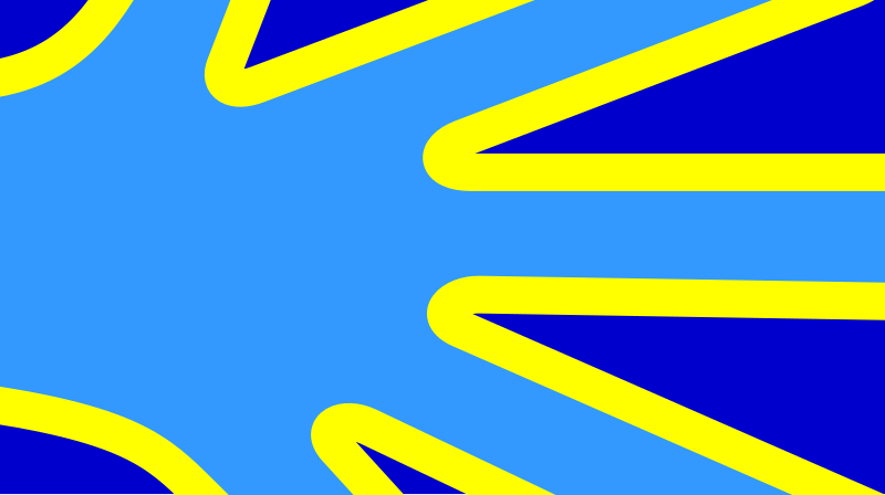
Designed by deafblind artist Arnaud Balard in 2013, it was adopted by the National Federation of the Deaf of France (Fédération nationale des sourds de France) in 2014 and by the Word Federation of the Deaf in 2023. It's official symbolism is:

  • Hand: The signing deaf community and sign languages

  • Fingers: Use of sign languages around the world (over 200 languages) and the 5 continents (in order from top to bottom Europe, the Americas, Asia, Oceania and Africa)

  • Turquoise: World color of sign language, deaf culture, and the signing deaf community

  • Yellow: Light, life, the awakened mind, and coexistence

  • Navy Blue: Planet Earth, humanity, and the color adopted to represent deafness

5


To review from my previous post,

  • 7 Stripes for 7 Articles instead of 13 for 13 colonies.

  • 27 Stars for 27 Amendments instead of 50 for 50 states.

  • Colors borrowed from Plains Nations cardinal direction colors as a way to include land recognition in the design.

I originally tried using The Statue of Liberty's Torch as a visual divider between both sides, but some folks opined that it was a bit too hard to discern, so instead I leaned a bit more into the land recognition aspect and borrowed a Northeastern Nations bit of iconography, the broken arrow being a symbol of peace, and a two arrow exchange representing war.

Decided to pull a Venice and include a peacetime and wartime variant of the flag just to be quirky:P.

6


Bauman's complaint at that meeting was that the flag did not depict an obvious Milwaukee landmark, unlike the current flag, which is a smorgasbord of pictorial imagery from the 1950s.

At the meeting, Bauman suggested plopping City Hall into the center of the People's Flag, and as you can see from the image above, he got busy on his computer to come up with a bastardization of the design that finds City Hall floating like a cruise ship into the Milwaukee harbor.

Does this guy also think that the Stars and Stripes is lacking a photo of the White House? How about the CN Tower plastered on the Canadian flag, or the Eiffel Tower on the French Tricolour?

7
8


A pirate flags guide with pics and info from Wikipedia

9


Instead of 13 stripes and 50 stars for colonies and states, this flag features 7 stripes and 27 stars for Articles of the Constitution and ensuing Amendments to it. I feel like mere territorial growth doesn't tell the story of America's development as a society and republic as well as tracking the changes to its constitution. Especially the voting rights amendments.

Colors borrow from the cardinal direction colors used by Indigenous American nations, (black and blue are interchangeable depending on which nation your speaking to). This was done to bake some land recognition into the flag.

Lastly the torch of Lady Liberty is included both to visually distinct the flag from the original stars and stripes, but also to signify America's status as a nation of immigrants. 99% of all Americans today either are an immigrant themselves or have an ancestor within living memory who was one, and Lady Liberty became a sort of patron saint of such folks by being the first sight a lot of people saw coming to America for the first time, not to mention how she's technically an immigrant herself having been gifted from france.

10
 
 
11


I didn't realize there was one for this. Aside from the text I think it's really nice. Unique but simplistic.

12


I came up with an idea for a flag of an interstellar federation for a Sci Fi project I've got floating around in my head. I don't think anything much will come of it, but I figured I might as well share my flag idea with you guys and see what you think.

The Flag of the Neo-Terran Federation is as follows: A deep blue field with a single black pile in the top quadrant. It has a center charge of a golden Phoenix, in a stylized form similar to Art Deco, the leading edges of its outstretched wings following the lines of the black pile. Beneath the wings of the phoenix are a number of Stars equaling the systems of the Federation.

I would like to know what you think of this design, as well as what you can infer of the federation based on its symbolism; mainly to make sure I got the symbolism correct. If anyone wants to draw and post this, I would be thrilled to see it.

13


I didn't expect to see this in the rural western US.

Please pardon the water drops in the image. I was shooting through a car window.

A better picture of the flag is on Wikipedia:
https://en.m.wikipedia.org/wiki/Buddhist_flag

14


cross-posted from: https://jlai.lu/post/7390776

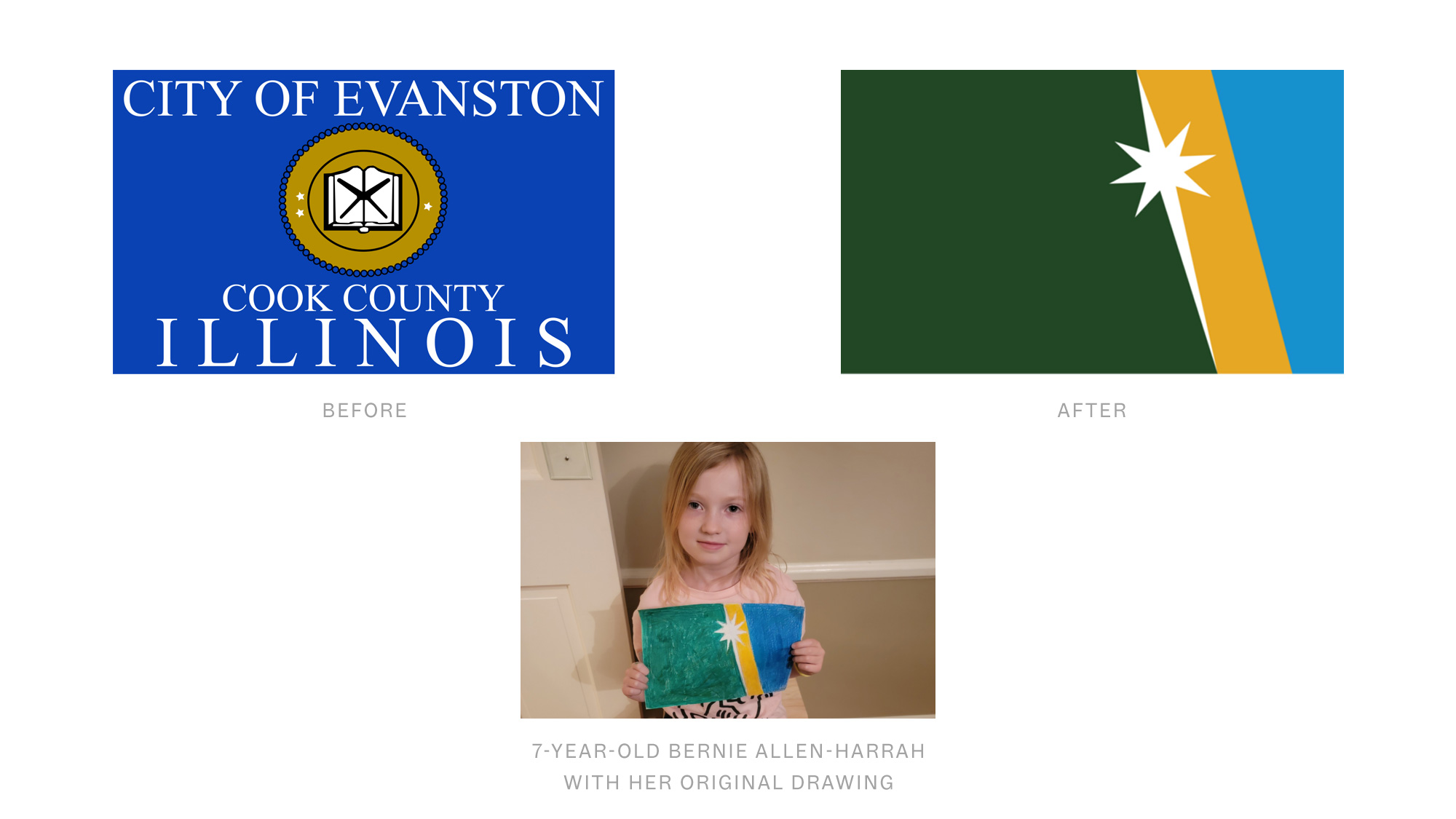
From https://content.govdelivery.com/accounts/ILEVANSTON/bulletins/39e986a

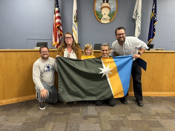
The City of Evanston is thrilled to announce the winner of the Mayor's Youth Flag Redesign Contest: Bernie Allen-Harrah, a talented 7-year-old in 1st grade at Dawes Elementary School, whose design captured the essence of our community. Bernie’s flag, selected from hundreds of submissions, was unveiled at last night’s City Council meeting.

Bernie Allen-Harrah’s winning design reflects the unique geography of Evanston. The selection panel, comprised of local professional graphic designers, was impressed with the design’s simplicity, symbolism, and aesthetic appeal.

15
 
 
16
 
 
17
 
 
18


Saw it flying on London Horse Guards building

19
 
 
20
 
 
21
22
 
 
23


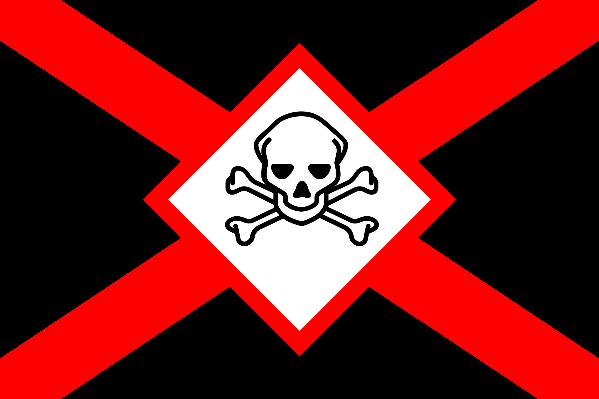
I made these to be a flag of evil or a flag of the enemy. Can be used for fictional Obviously Evil countries or for aggressor aircraft. Which one do you like better?

24
 
 
25
 
 
view more: next ›