this post was submitted on 09 Dec 2023
-2 points (43.8% liked)

Photography

4515 readers
2 users here now

A community to post about photography:

We allow a wide range of topics here including; your own images, technical questions, gear talk, photography blogs etc. Please be respectful and don't spam.

founded 1 year ago
MODERATORS
 
all 5 comments
sorted by: hot top controversial new old
[–] ludw@lemmy.world 4 points 11 months ago* (last edited 11 months ago) (1 children)

Some quick feedback:

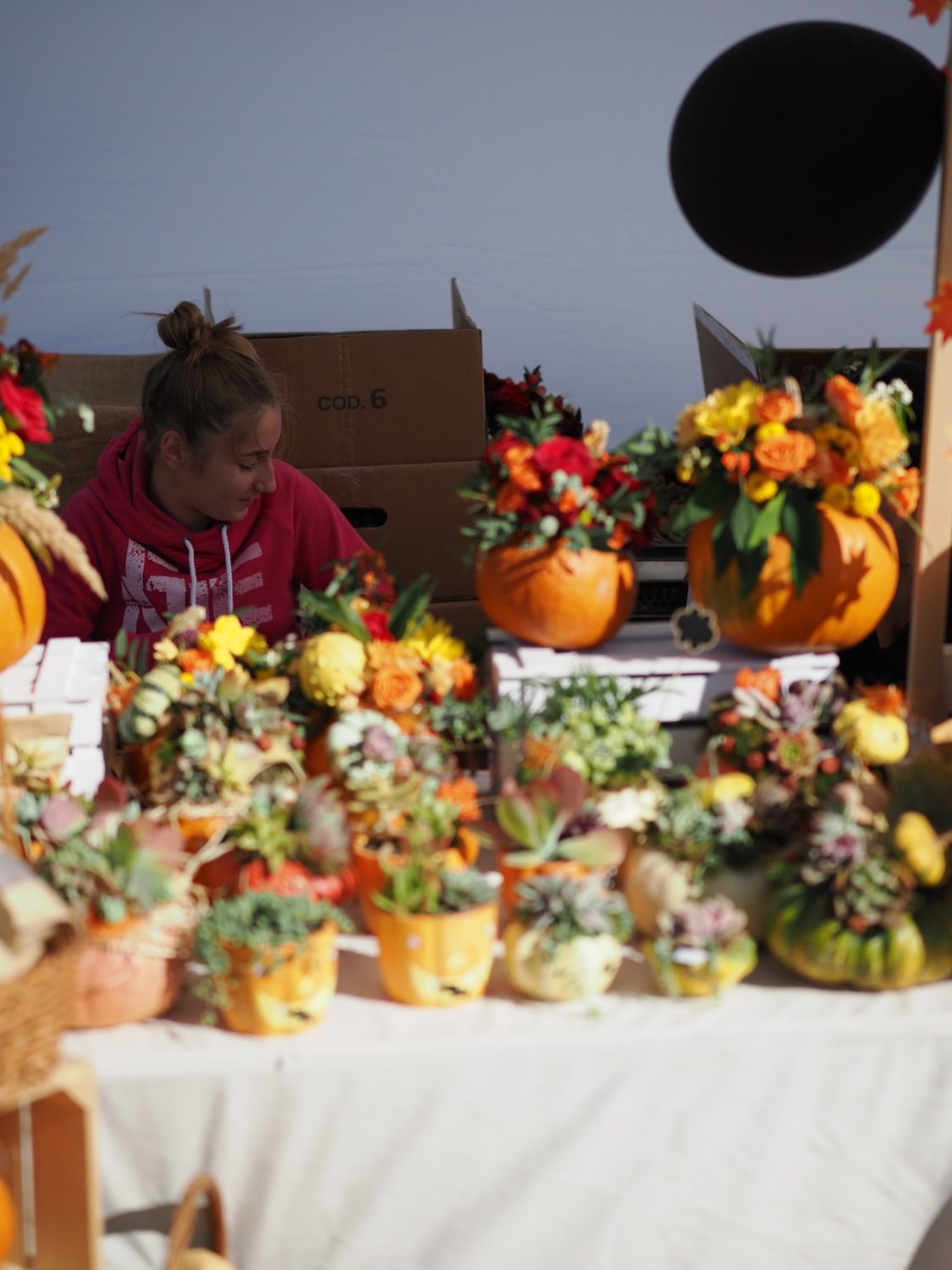
The two things that draw my attention are the person looking away and the black blob in the top right. The black blob mostly feels like a distraction. The person is not well lit and almost hard to see compared with the almost over exposed foreground. There's a lot of interesting stuff in the picture but kinda mixed messages for what to focus on with the parts in focus being so dim.

I would try cropping much tighter around the subject and see if you can find a stronger composition.
[–] southsamurai@sh.itjust.works 4 points 11 months ago

I dunno, I don't think it works.

Which seems dumb to say when nobody knows what you were going for except you, but it just lacks cohesion. There's no sense of life to the image, despite there being a lot in the image that should make it space alive, if that makes sense?

You know how it is though, everyone has their own perspective with imagery. It's exceedingly difficult to frame any image in a way that translates what the intent is to even a big section of possible viewers, so I could just be missing the connection

[–] daft61lunacy@lemmy.world 1 points 11 months ago

Thanks I appreciate feedback!

[–] daft61lunacy@lemmy.world 1 points 11 months ago

OM-1 Olympus 45 mm f/1.2 lense @ ISO 250 f/1.4 1/16000 ss -0,3 ev.