this post was submitted on 14 Aug 2024
29 points (87.2% liked)
Data Is Beautiful
6891 readers
135 users here now
A place to share and discuss data visualizations. #dataviz
(under new moderation as of 2024-01, please let me know if there are any changes you want to see!)
founded 3 years ago
MODERATORS
you are viewing a single comment's thread
view the rest of the comments
view the rest of the comments

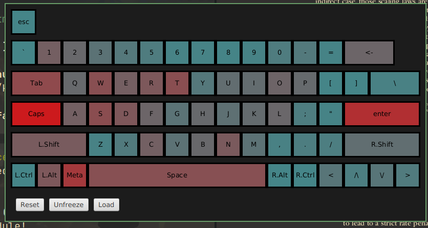
I'm assuming blue means a key is more used, so it's showing Caps never gets used. enter doesn't make sense though, so maybe it's only showing key combinations?
No, the red is more used, I just have Caps remapped to control
That seems pretty misleading...
Why? The purpose of this project was for me to see which keys I press more often so I know which fingers get stressed, and it exactly what the project does
From the title, it sounds like something that any keyboard shortcut enthusiast would be able to extrapolate to their own shortcuts. But if yours are custom, then it's more like a fun fact about yourself.
Fair enough. I've only created a visualization tool, I haven't gathered statistics.