this post was submitted on 15 Dec 2023
857 points (96.7% liked)
AssholeDesign
7423 readers
1 users here now
This is a community for designs specifically crafted to make the experience worse for the user. This can be due to greed, apathy, laziness or just downright scumbaggery.
founded 1 year ago
MODERATORS
you are viewing a single comment's thread
view the rest of the comments
view the rest of the comments
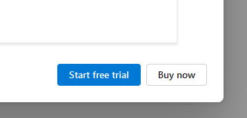
To me, sans any context, the asshole aspect of the design is that there's no explicit button and comparable button to decline the offer / close the window/pop-up/whatever. Though it's also very possible that this was specifically cropped so as to exclude context such as the existence of a close button or other clues that might offer some rationale for this design.
I don't see the Buy now button as being disguised as anything, personally. This just looks like there's standard theming in place where one button is classed as a primary button and the other as a secondary or perhaps default button. Pretty vanilla stuff and a common approach when there are choices like this.
Yeah, usually the button they want you to press is the one that's colored.
If they want you to buy something, why make that the colorless one?
That’s the point. They’re abusing that common knowledge. They know that you’ll glance at the buttons and in that split second, assume the white button is “cancel”, and click that. They’re hoping some of those errant clicks turn into sales