this post was submitted on 30 Jul 2023
363 points (98.1% liked)
Lemmy Apps
5469 readers
1 users here now
A home for discussion of Lemmy apps and tools for all platforms.
RULES:
- No spamming
- Be nice and have fun
- Follow the general lemmy.world rules
An extensive list of Lemmy apps is available here:
Visit our partner Communities!
Lemmy Plugins and Userscripts is a great place to enhance the Lemmy browsing experience. !plugins@sh.itjust.works
Lemmy Integrations is a community about all integrations with the lemmy API. Bots, Scripts, New Apps, etc. !lemmy_integrations@lemmy.dbzer0.com
Lemmy Bots and Tools is a place to discuss and show off bots, tools, front ends, etc. you’re making that relate to lemmy. !lemmy_dev@programming.dev
Lemmy App Development is a place for Lemmy builders to chat about building apps, clients, tools and bots for the Lemmy platform. !lemmydev@lemm.ee
founded 1 year ago
MODERATORS
you are viewing a single comment's thread
view the rest of the comments
view the rest of the comments

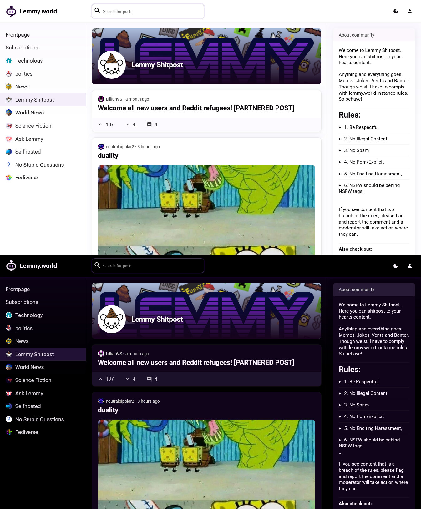
Late to the party here but this is exactly what I've been thinking Lemmy needs to attract the less tech-savvy folks who absolutely don't need/want all the hyper specific info and features! Well done!
I know I'll get pushback for this, but I'd like to see something like this become the default so new people don't get scared away because it's "too complicated" and then the current one become hosted under a subdomain for all the techie folks who like the control/info.
Thank you! There's obviously still quite a way to go, but I'm hoping I or someone else will get there eventually.
I agree that defaults matter a lot. You get only one chance to make a first impression, and most people will probably decide within a few seconds whether Lemmy is worth exploring. We need to get those users excited to explore the platform.
Granted, some people may be scared that it's going to "dumb down" Lemmy. But Lemmy will always continue to be about freedom of choice: you pick an instance you like, instances can offer any selection of web UIs they want, and you pick from the offered web UIs.
Well said! This was far and away the most common complaint while I've been telling folks about Lemmy on Reddit, and I think plopping them right into a familiar, simple design would go a long way. At any rate, it's good to see more UI people get involved since it feels a little neglected among the 3PAs and front ends, in my opinion.
My other main complaint was that people don't get how or where to sign up, and join-lemmy.org is just a bad introduction to the concept of instances. Would love to see that piece of Lemmy improved as well!
You're hitting the nail on the head. Reddit-style websites are familiar to a lot of people, but we need to do a better job of explaining instances and federation. Not with text or technobabble, but with a UI that's so intuitive it almost speaks for itself.